
Just recently, I learned that with the introduction of their new black-and-white device, the e-ink tablet, which I currently use—the reMarkable 2 (or RM2)—became discontinued, retro tech. This is just as well, as I wanted to write a review of the RM2 as a distraction-free typing device for some time:
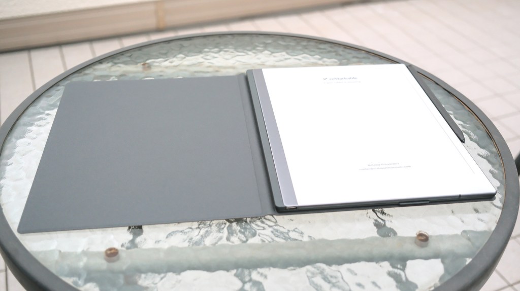
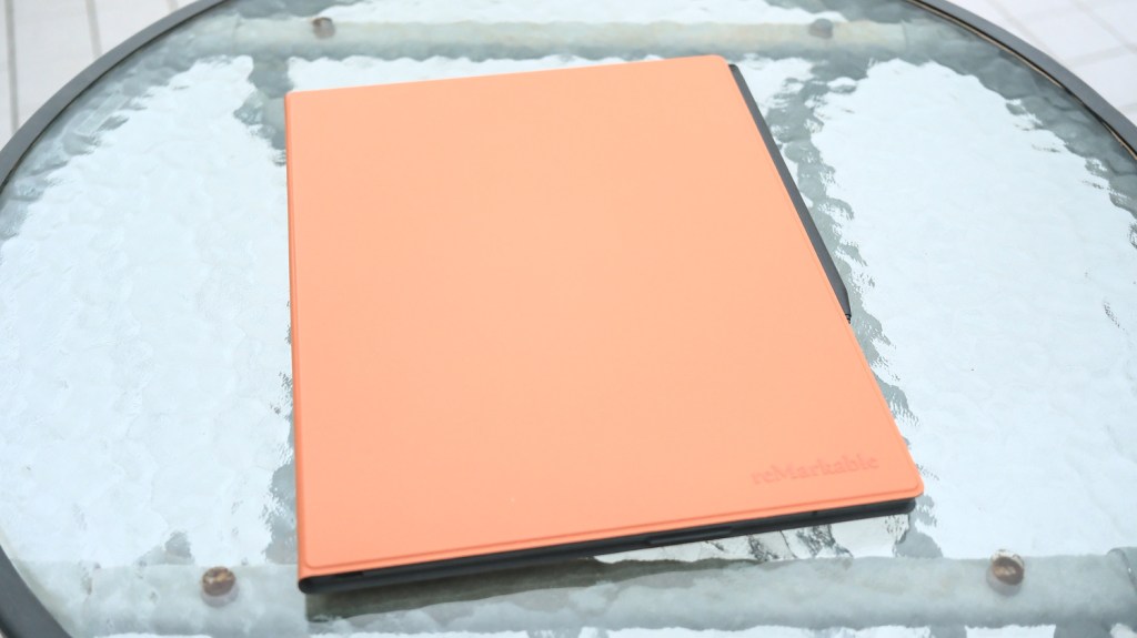
A device for output
One thing I’ve noticed after a few years of using distraction-free devices is that I almost exclusively use them when I have something definite to create. When a blog post or a fragment of my next book needs writing, I’ll use my POMERA DM250 for the first draft and polish the text up later on my laptop. In other words, what I really have use for is a simple digital typewriter for creative output.
This is why I started wondering about using the reMarkable 2 for writing. Because of the proprietary formats it uses and my choosing to keep the device offline (not paired with the expensive online subscription service), it mostly works one-way; I can output the things I write and draw on the tablet, but synchronizing the other way round is impractical and sometimes even impossible.
So, when it comes to typed text, the content can be exported as long PDF pages containing copy-able text together with any handwritten notes and sketches. This functionality is just enough for me to write a first draft of a page of my book that contains short passages of text (I will correct later with my publishing house editor) and rough sketches for some illustrations (I will draw later by hand). Until now, for a task like this, I had to use the distraction-filled iPad PRO with its bulky keyboard folio, combined with a subscription app like Notability.
Hardware – adding the keyboard
The problem is that the on-screen keyboard of the reMarkable 2 is useless for any longer writing. It requires the user to switch to the numbers and signs “tab” to even type an apostrophe, so it’s only good for entering passwords or naming folders. This is a handwriting-first device after all. The tablet has a USB-C port for data exchange and charging, but (without serious Linux-based firmware hacking, which voids your warranty), sadly, the port does not do anything else, nor can we use wireless keyboards. However, on the long side of the tablet, we also get another USB in the form of a few flat connection spots for the dedicated keyboard accessory.
The tablet itself is already quite old-ish, so there are many reviews online describing its strengths, weaknesses, and quirks of the OS, so I will try to focus here mostly on the keyboard accessory experience.
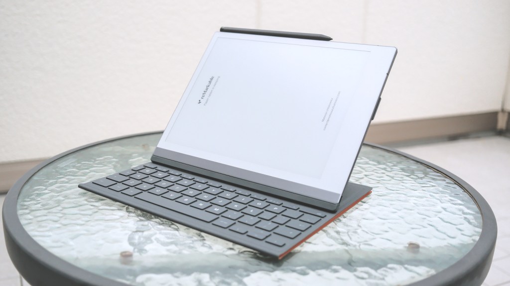
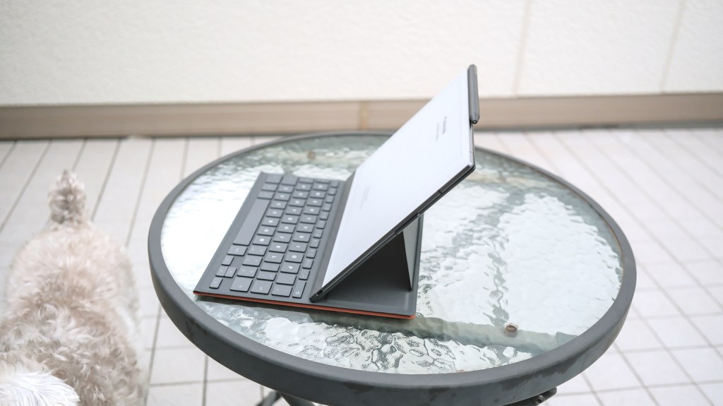
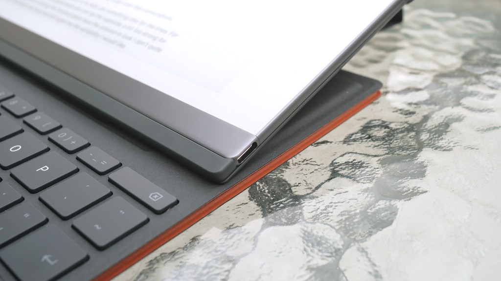
First, the keyboard folio is expensive—I’m always a bit skeptical about buying something that’s basically a bunch of thin plastic bending and folding in weird ways many times a day, especially when it’s compatible with just one tablet model, and both are already discontinued—but, in the name of science, I decided to pull the trigger.
The overall impression of the keyboard is quirky but well-built and designed. I like it far more than the iPad PRO floating keyboard folio, for example. Here, the tablet is placed on top of the keyboard when the case is folded, which allows the folio to be used like a regular case for handwriting or reading. The tablet can also be placed at two angles: one better for typing, and a shallower one for simultaneously taking notes with the pen. At both of these angles, the tablet is so stable that I cannot topple it or move it with the pen pressing on the screen, even quite strongly. Yes, the folio’s design feels counterintuitive at first (“how do I open this, again?”). But it’s better than APPLE’s “just make stuff heavier so it doesn’t fall backwards” solution.
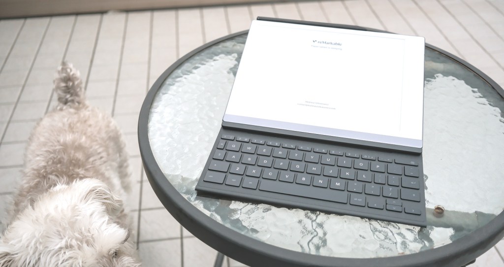
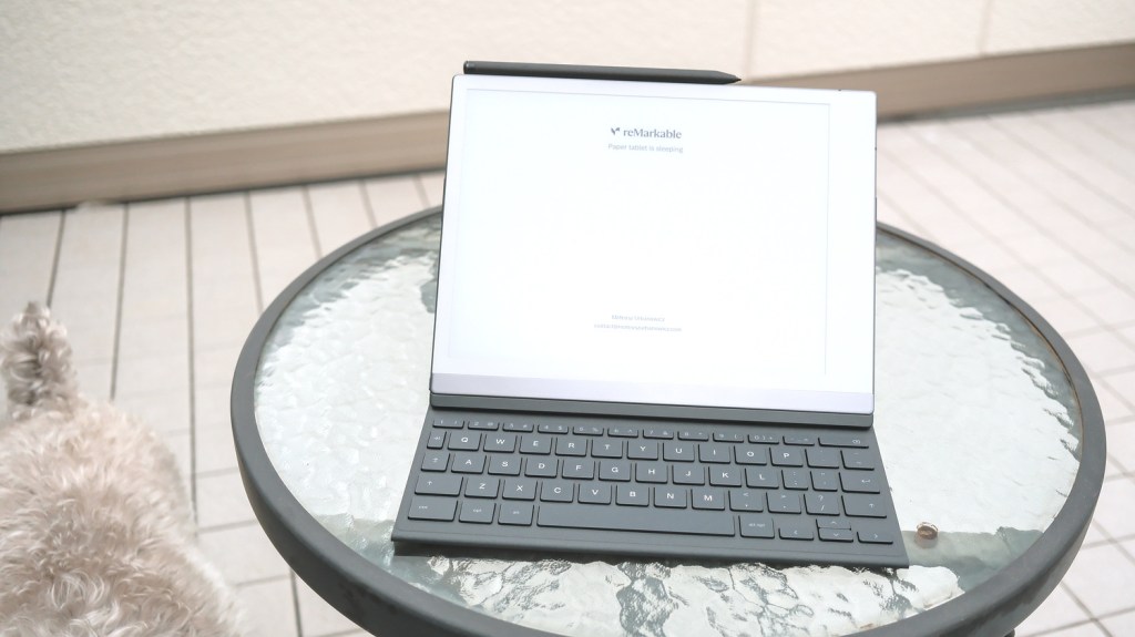
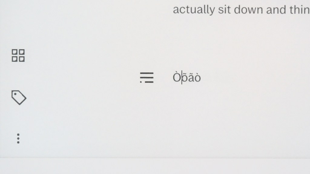
The keyboard keys feel like any great quality low-profile laptop keyboard, but the layout is, let’s say, “unique”. There is no touchpad (thank Goodness), but also a few standard keys (like the square brackets, for example) are missing too. Instead, we get two diacritic special keys which allow, when combined with other letters, for results like ś, ñ, or ö, and so on. This is the first time I saw such a keyboard layout. Maybe it’s because of the device’s Norwegian origins? After all, the Japanese POMERA also has many additional keys and functions. The square bracket lovers can sleep in peace, though—less frequently used symbols can be accessed through the CTRL+ALT+SPACE shortcut, which displays an on-screen palette that stays at the bottom of the screen until dismissed. This palette also contains an em-dash, which is nice for anyone writing prose.
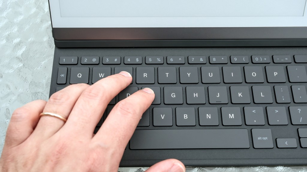
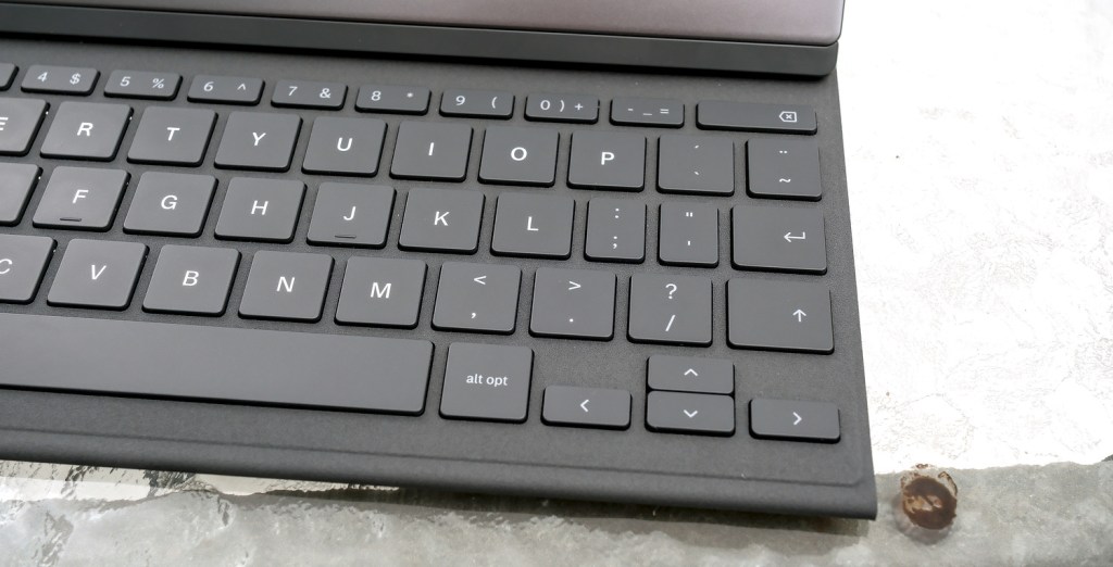
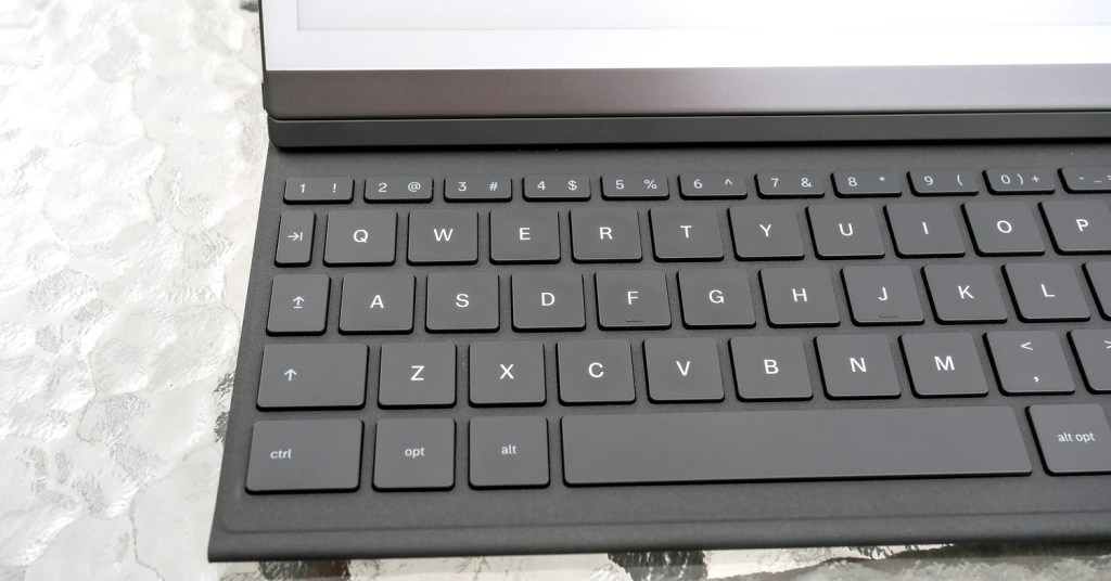
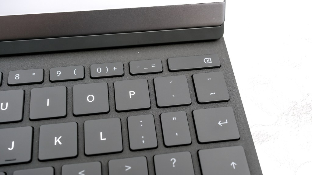
THERE IS A CAPS-LOCK, though it has no indicator, but the TAB key, though present, does literally nothing when writing, and only serves navigational purposes for some reason. Equally baffling is the choice of including only two keys that have three glyphs assigned to them (for example: – _ = on one key), with the last option requiring ALT as a modifier. Why not use this for more keys and get rid of the aforementioned on-screen palette? I don’t know.
In the initial setup, we can choose which key (OPT or CTRL) does all the shortcuts, which is nice, but that also leaves the other key unutilised at all, as far as I can tell.
So yes, the layout is quirky, but not so it would slow down a visual-typer like me, and after some getting used to actually worked for me exceedingly well.
Just looking at the spec-sheets, one major downside compared to the iPad folio is the lack of key backlight, which might feel limiting, until we remind ourselves that we are using an e-ink device that itself has no backlight.
The software side
The reMarkable 2 is a pen-oriented device, but the typing experience surprised me as thought-through and well executed. I did try to type on the Supernote, but the results did not encourage me. With the reMarkable, I feel like it someone actually put thought into the programming.
Here is the catch: with the keyboard connected, we can start typing at any page in our document, but the method is similar to typing a single column of text in a MS-WORD document, where all annotations and images drawn by hand are “attached to text” and move with the changes. This will disappoint any note-takers who want to type wherever they tap, make mind-maps, move and shape text freely, or add typed comments over images. It’s also not feasible to add text to a page that already has a lot of hand-drawn notes because things tend to break.
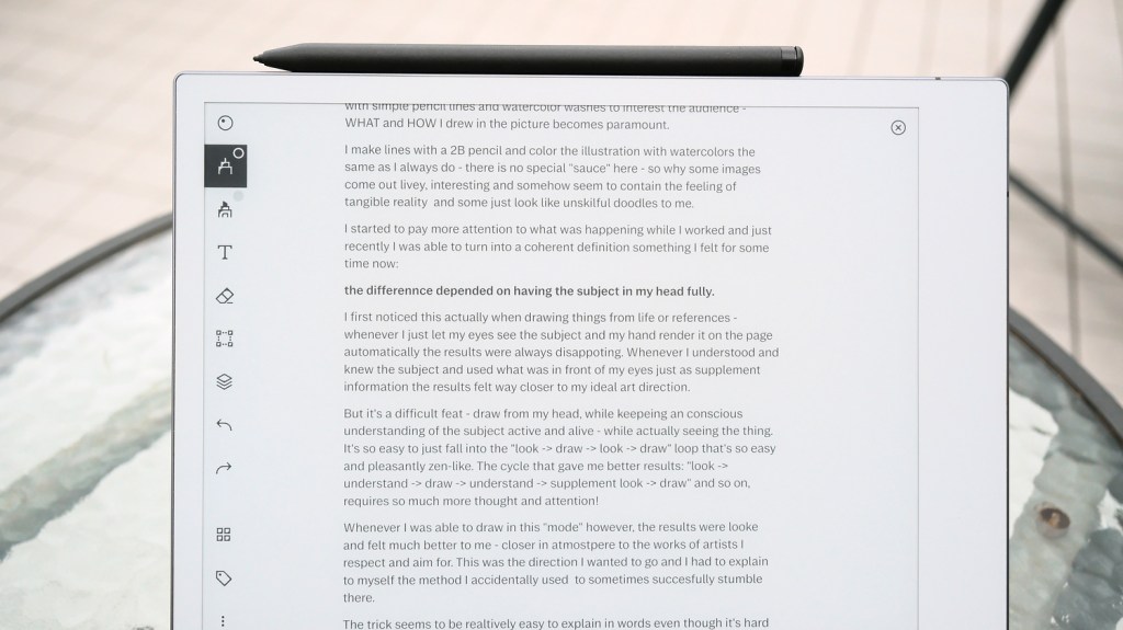
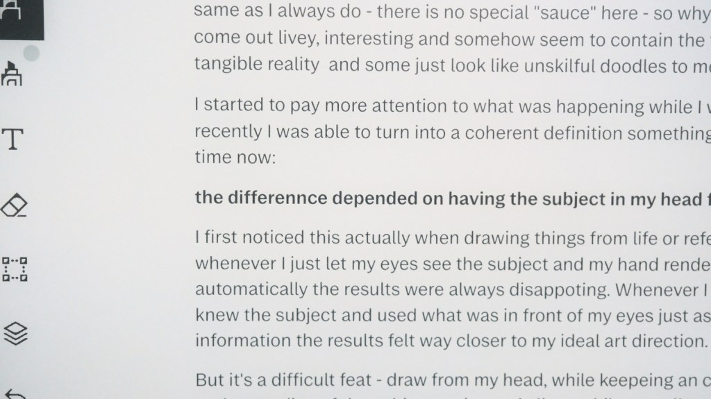
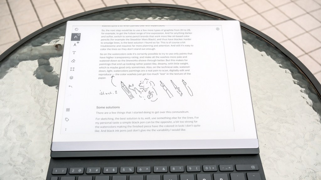
Despite those limitations, personally, I find that for longer texts, the reMarkable’s simplistic approach is acceptable. I think that for many, this might be the biggest divisive point when deciding whether to buy this keyboard. If someone is coming from typing their drafts on a POMERA or a FreeWrite, they will feel at home, but if they are used to the freedom of iPad apps, the reMarkable + keyboard combo is probably not for them.
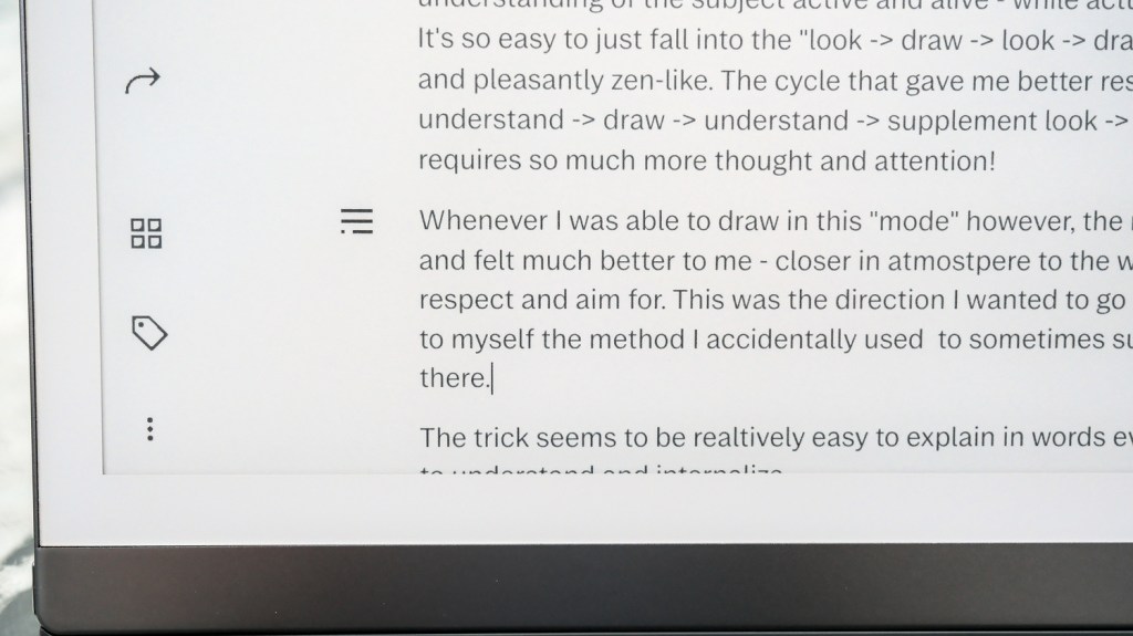
There are some basic options available to customize the typed contents. We can choose three widths for the column of text: wider for more content visible at once, or narrower for more space for side-annotations. There are also three title styles, a paragraph style, and three list types to choose from a hamburger-style menu that appears to the left of the text when we pause typing.
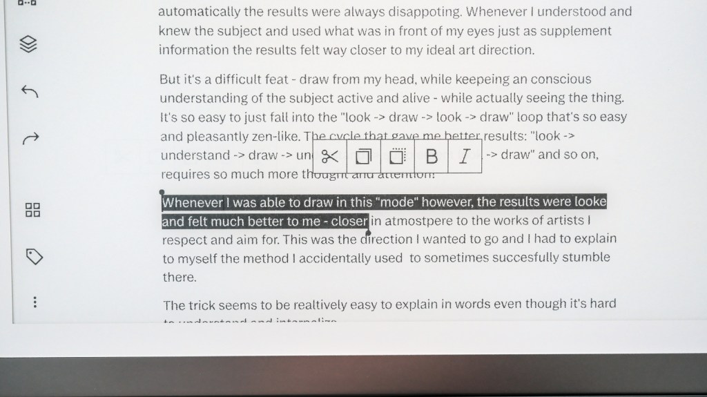
Additionally, when any text is selected, we also get a pop-up menu for bold and italics together with simple editing like copy, cut, and paste (with the ability of moving text between pages or documents). Through the standard menu present on the left side of the screen, we can also undo and redo typed changes easily.
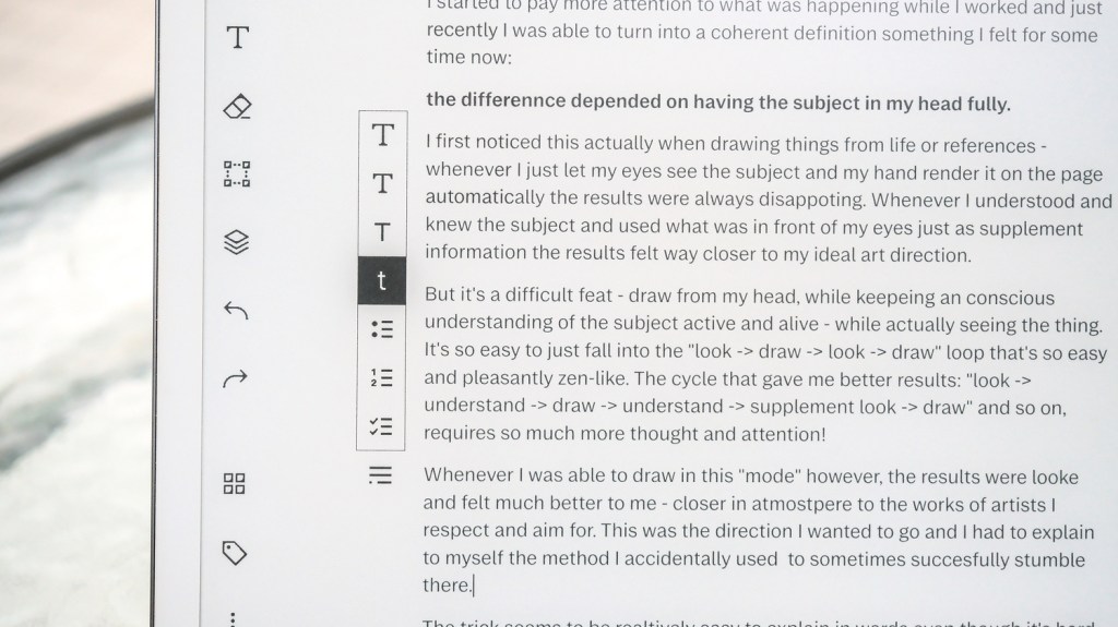
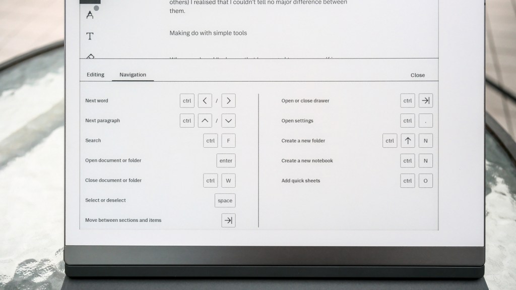
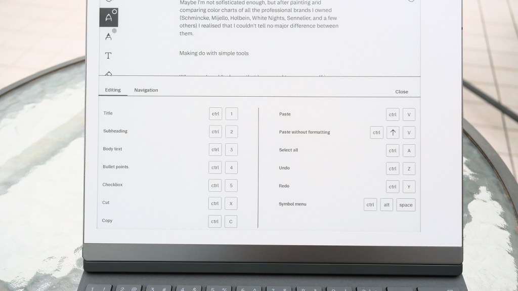
All these options are, of course, accessible through standard keyboard shortcuts, for which a cheatsheet appears after we press the shortcut key (I choose CTRL) for three seconds. This is useful because there are also navigational shortcuts listed there. We can quickly move the cursor by word or by whole paragraphs, or search in typed text (but there’s sadly nothing fancier, like find-and-replace or wordcount). As far as I can tell, there are also no HOME and END equivalent shortcuts.
As software functionality goes, this is basically all what we get. There are no tables, no custom fonts, no spell-check, no paragraph or text alignment, even. This is a usable but still very barebones editor.
Touch and pen
One of the biggest advantages of using the reMarkable for typing, though, is the ability to use the touch-enabled screen to scroll, move the cursor, and select text either by dragging or by double-tapping. This is something that makes editing mistakes a lot more manageable than on a POMERA DM30 or, especially, the FreeWrite, if I consider other e-ink devices I have used. The pen, though, always works as a drawing or highlighting tool. You can’t modify the text by crossing words out (like on the Apple eMate) or drawing editor’s marks (like on the Supernote).
As I said before, the experience is similar to editing a simple MS-WORD document, so, for example, in order to make a pen-sketch between paragraphs first, I have to open space in the text using a few ENTER presses, and then the drawn image will continue to live in this area even if I add some text higher up in the content. Also, any marks, notes, and highlights drawn on top of the text itself move with it, and do it quite well, actually. Any more complicated stuff often breaks through. For example, if I try to circle and connect two parts of the text and then start modifying the contents of the passage, the hand-drawn notes will break and move apart, being tied to different parts of the text. The exception here is the highlighter pen if we turn on the “Snap to text” option. The highlight will expand or contract accordingly.
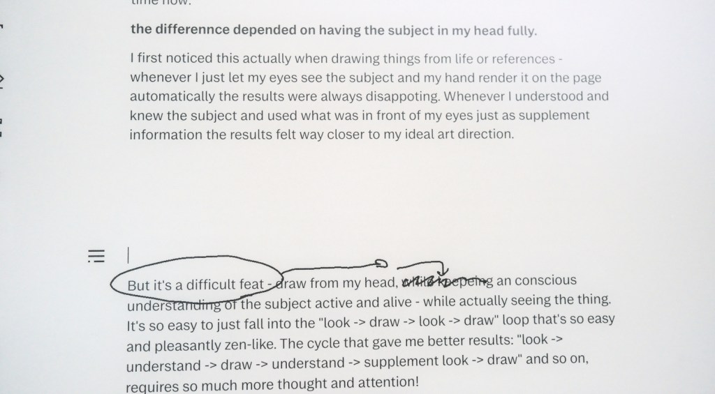
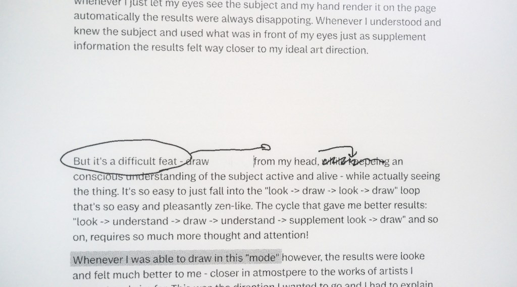
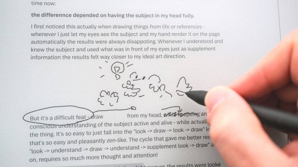
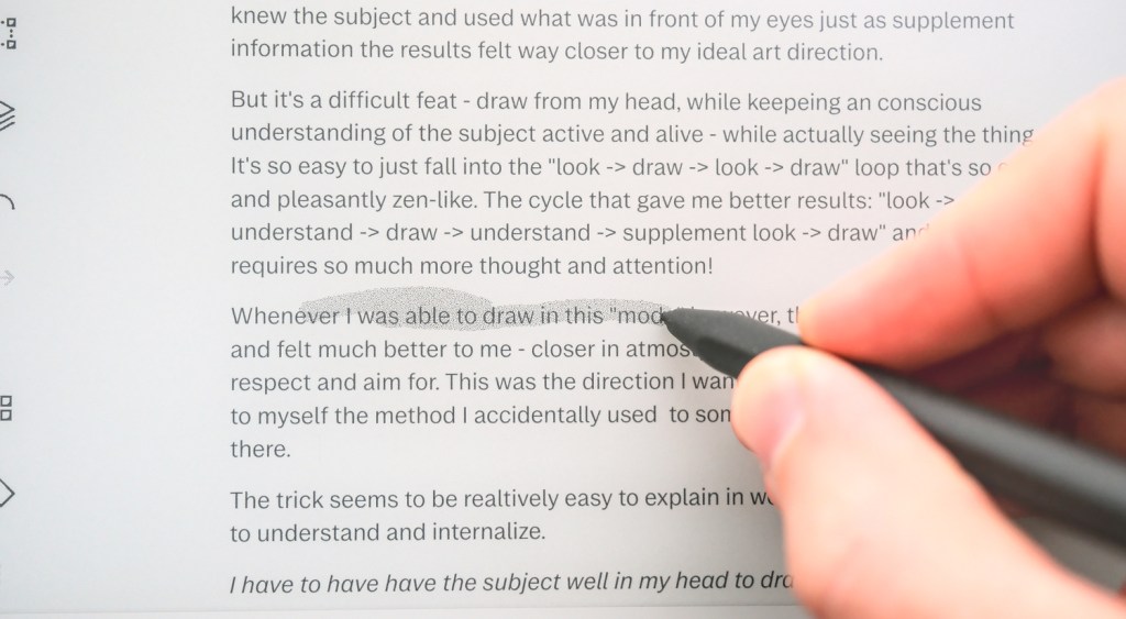
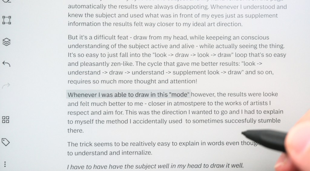
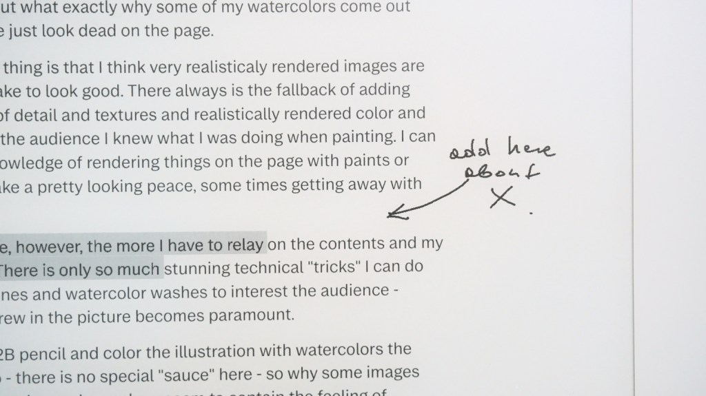
For my needs—open a few lines and make a thumbnail of an illustration, or insert a highlight and a hand-written memo—the pen input works as it should. It doesn’t interfere with the typed content itself, and doesn’t get copied from the PDF on my laptop either.
Writing with a bottle of e-ink
The reMarkable 2 has, in my opinion, one of the best black-and-white e-ink screen implementations I have worked with so far. While drawing with the pen, there is no noticeable lag, and the typing experience is very fast as well. When we press the first keyboard key, the screen changes modes (the resolution drops a little) and the refresh rate gets quite fast. When we pause typing for a second, the screen reverts to high-resolution mode. Any bigger edits, scrolling, or displaying of the menus triggers a full refresh with the whole screen blinking black to get rid of the ghosting. While editing already written text, these bigger refreshes can lead to quite frequent flashing, which can get annoying, especially for touch-typing users. The cursor moves fast, is easily visible, and the words appear as fast as I can type them. Also, scrolling (with two fingers or keyboard shortcuts) or zooming (with pinching or using the CTRL+ or – shortcuts) is also fast enough not to be dreaded too much.
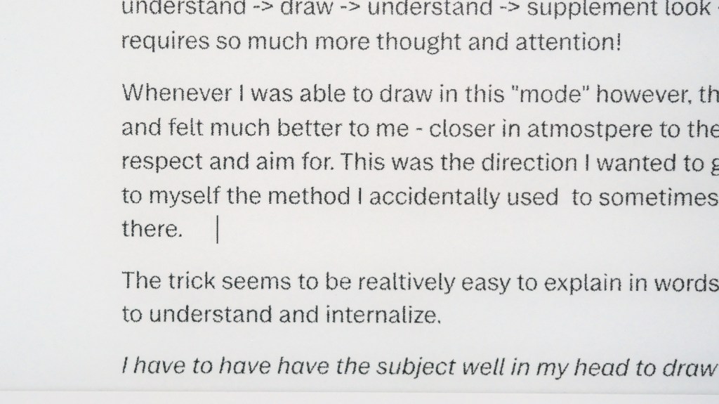
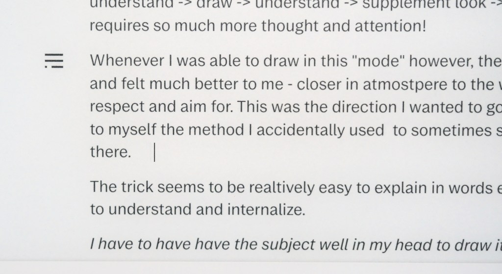
I’m yet to experience writing on more fully featured e-ink solutions like the BOOX tablets, but as far as a device meant mostly for pen-input goes, overall, the typing experience on RM2 fares quite well in my opinion. For straight-out text input, I still prefer my POMERA, but the touch-enabled huge screen is just so much better for reading the text back and any editing.
The interoperability
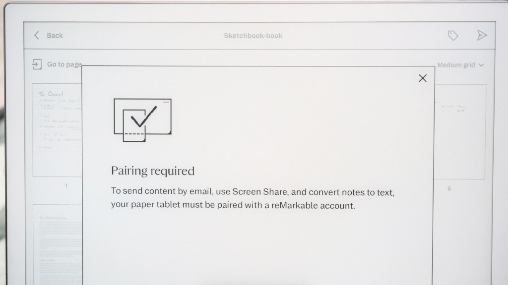
And here we come to the Achilles’ heel of the reMarkable 2. My basic use of it without any online backend consists of connecting the device via USB, enabling the drive mode, and importing ePUB and PDF files (to read or markup, typed text in these cannot be edited) or exporting my writings and scribbles as PDF files. Anything more, like sending files through e-mail or converting handwritten text to type, requires pairing the device with an online account (free). Further integrations, proper unlimited sync, importing text documents so they are editable, or adding image files into the notebooks all require the paid subscription. I don’t exactly hate this system, but I don’t like it either. In my opinion, only things like the OCR conversion or file storage that actually require significant “cloud space” should be a paid service and much, much cheaper, but that’s me.
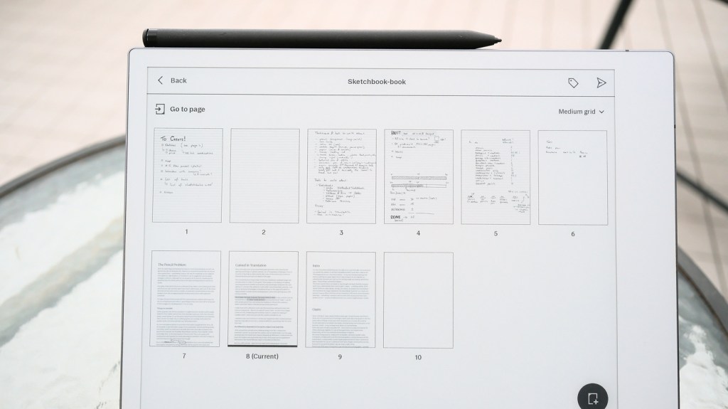
The one thing I like about how reMarkable handles contents is that I can have a notebook that combines “normal” pages with hand-drawn doodles and infinite-scroll pages with typed text in one file that still can be later exported as a PDF—but that’s about it when it comes to positives in file compatibility.
Verdict on the typing experience
Downsides:
• High price.
• Like all such keyboard cases, longevity is an unknown.
• Quirky layout that could have been more efficient.
• The single-column MS-WORD document-like approach can be a deal-breaker.
• File interoperability, import, and export are awful and annoying if you don’t pay for a subscription.
Upsides:
• Makes a neat e-ink tablet into a solid and fast distraction-free typewriter.
• The typing experience, feel of the keyboard, etc., is great for the size.
• Very stable design, even when using the pen or touch.
• The folio can still be used as a regular case, relatively light.
• The touch and pen drawing functionality allows for more creativity.
From the moment I started using my first e-ink device (one of the early SONY e-readers), I wished for a solution that could be my notebook, sketchbook, and e-reader. Both the Supernote and the reMarkable worked well enough for those three uses while staying distraction-free. Now that the reMarkable can also transform into a simple typing device, I have even more chances to use it.
I still think the POMERA DM250 is overall the better choice for pure first-draft text input (currently, maybe the best on the market especially with the US version out as well), being outstandingly robust and dependable, much faster, with more text editing functionality, and far better interoperability (and no monthly fees).
But for me, the allure of the gentle e-ink display and the hand-writing // drawing functionality can’t be understated. The option to just detach the screen and re-read through the text, doodle comments, or sketch-in some drawings is a big selling point and something that allows me to move even further away from laptops and iPads. A win for a more task-oriented, simpler workspace.
Do I recommend buying a reMarkable 2? Maybe if one finds a set with the keyboard folio and the pen, at a good price? But as this tablet is discontinued and the case is not compatible with any other model, the RM2+Folio combination feels a bit like a high-tech dead end. To be honest, this is a very frustrating thing for me to see, as I would like to root for companies like reMarkable, that used to use e-ink and Linux to make top market products that were able to compete with giants like Apple on design and quality. For me, despite the irritating artificial limitations of the subscription model, the reMarkable 2 still feels a bit like a device from the future.


Leave a Reply