Works in Series
When creating art I often work on bigger, thematic projects that consist of several connected pieces, with some of such cycles growing enough to even become books, art-albums or exhibitions.
In Between
2024 – ongoing
A new series of large format watercolor and color ink paintings that focuses on the uncanny, sometimes abandoned, in-between spaces.

Moments in Time
2022 – ongoing
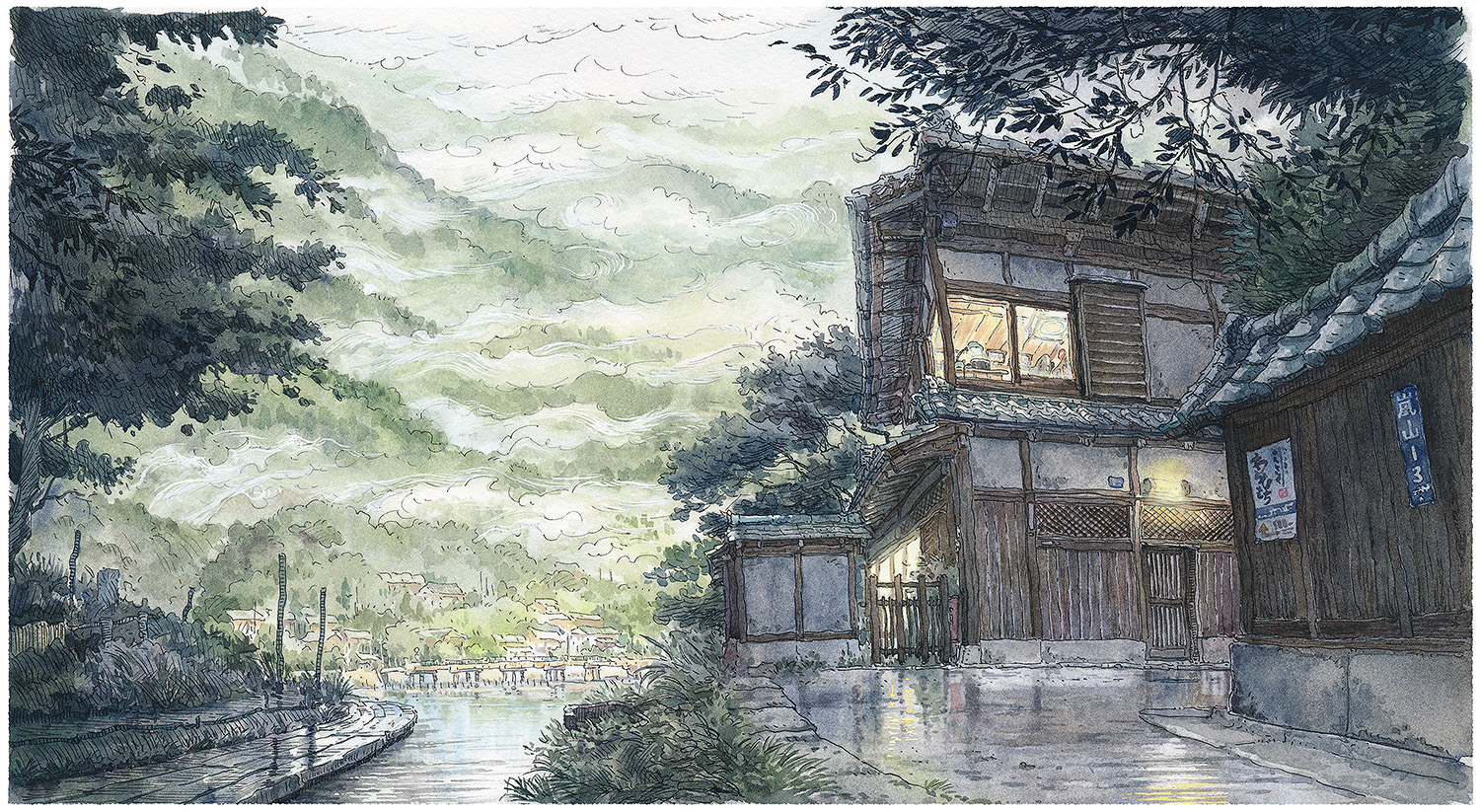
This series of illustrations started with the cover image for my 2022 book “Kuradashi.” When making this watercolor and pencil painting, I focused more on the atmosphere and feelings I wanted to convey instead of just following an interesting photo as a reference. I imagined a scene containing a Kura (Japanese warehouse) being open on a windy but bright autumn day from scratch, making a lot of rough thumbnails and sketches and exploring the idea deeply before starting the final image. To my surprise, the contents of the picture flowed from my imagination quite freely, and I had just to look up and confirm a few architectural details of the iconic design of the building to finish the illustration. The experience of making this image was so refreshing, and I liked the result enough that I tried to capture similar atmosphere-based ideas in a series of works.


Block of Flats
2021 – 2022
As with a lot of my series work, I painted the first piece more as a test of my abilities to render things like this with only watercolors. This was quite a challenge – with the cloudy, stormy sky and the apartment block’s wall lit up with the last light of the day.
I liked this format and atmosphere enough that for some time, I kept looking for exciting buildings (and times of day) that would fit this pattern – and a small series of paintings was born. I think I’m done making it for now, but who knows – I might still find a new, perfect-to-feature block and add it to the lineup.


Ukiyo-e works
2020, 2021
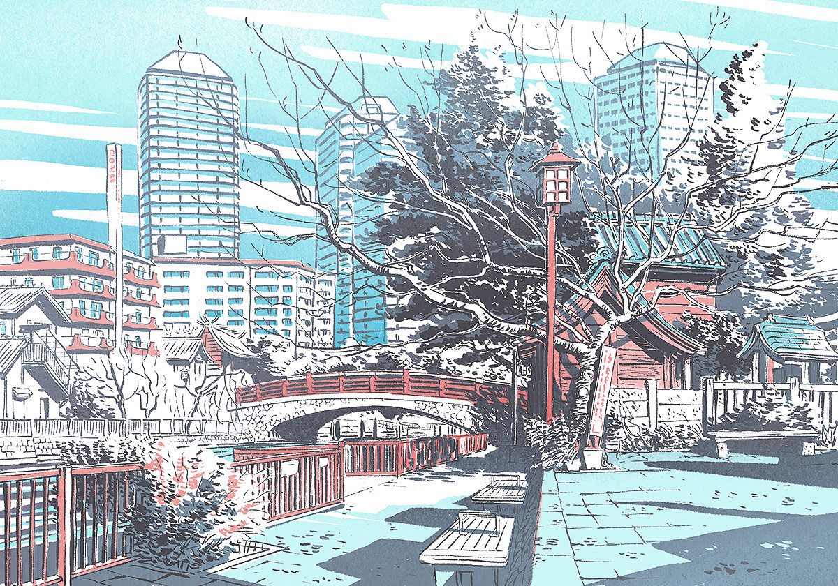
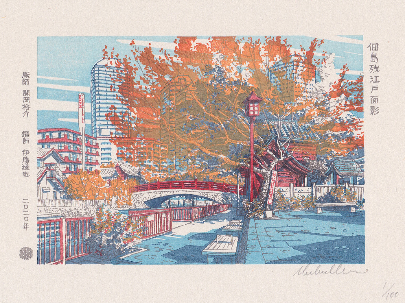
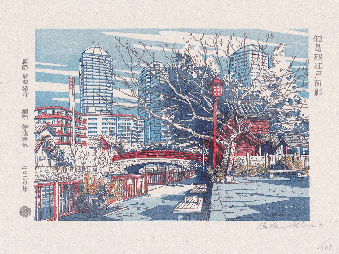
I was asked by the UKIYO-E Project to produce an illustration that would be later used as a base for a series of Japanese, traditional “ukiyo-e” woodblock prints. I drew a landscape ukiyo-e depicting Tsukuda, a neighborhood next to Tsukishima station in the east of Tokyo. In it, I tried to capture the striking contrast between the modern architecture and historical elements that co-exist in harmony in Tsukuda today in the design.
Design: URBANOWICZ Mateusz
Woodcarver: SEKIOKA Senrei III
Printer: ITO Tatsuya
Year: 2020, by UKIYO-E PROJECT
Edition: 100 per season and outline
Size: Chuban (185mm x 242mm)
Paper: Echizen Kizuki Housho
I also designed an ukiyo-e woodblock print for a collaboration with Ukiyo-e Project and COEDO Brewery based in Kawagoe city, Saitama Prefecture, known for their high-quality beer brewed with carefully selected ingredients and local water. This illustration is used for their “Vestiges of Edo at Bell Tower” limited edition beer.
Design: URBANOWICZ Mateusz
Woodcarver: SEKIOKA Senrei III
Printer: ITO Tatsuya
Year: 2021, by UKIYO-E PROJECT
Edition: Noon: limited edition of 100, Evening: limited edition of 20
Size: Chuban (185mm x 242mm)
Paper: Echizen Kizuki Housho




City in Paint
Sept – Dec 2020
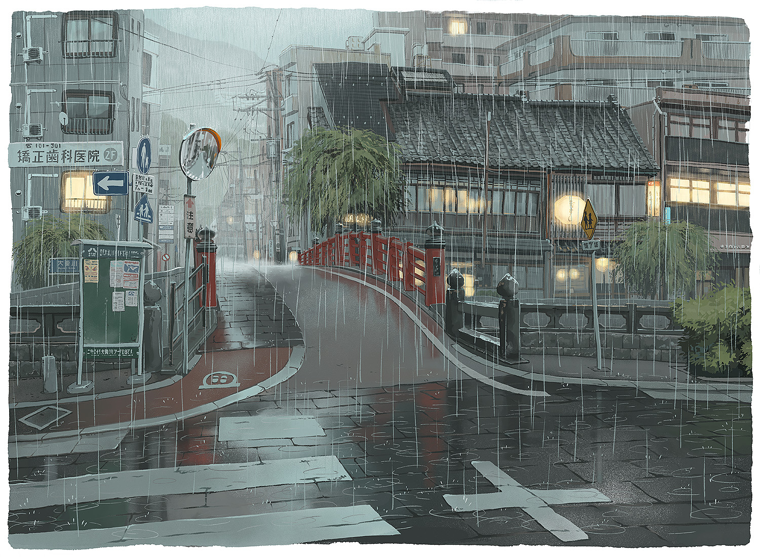
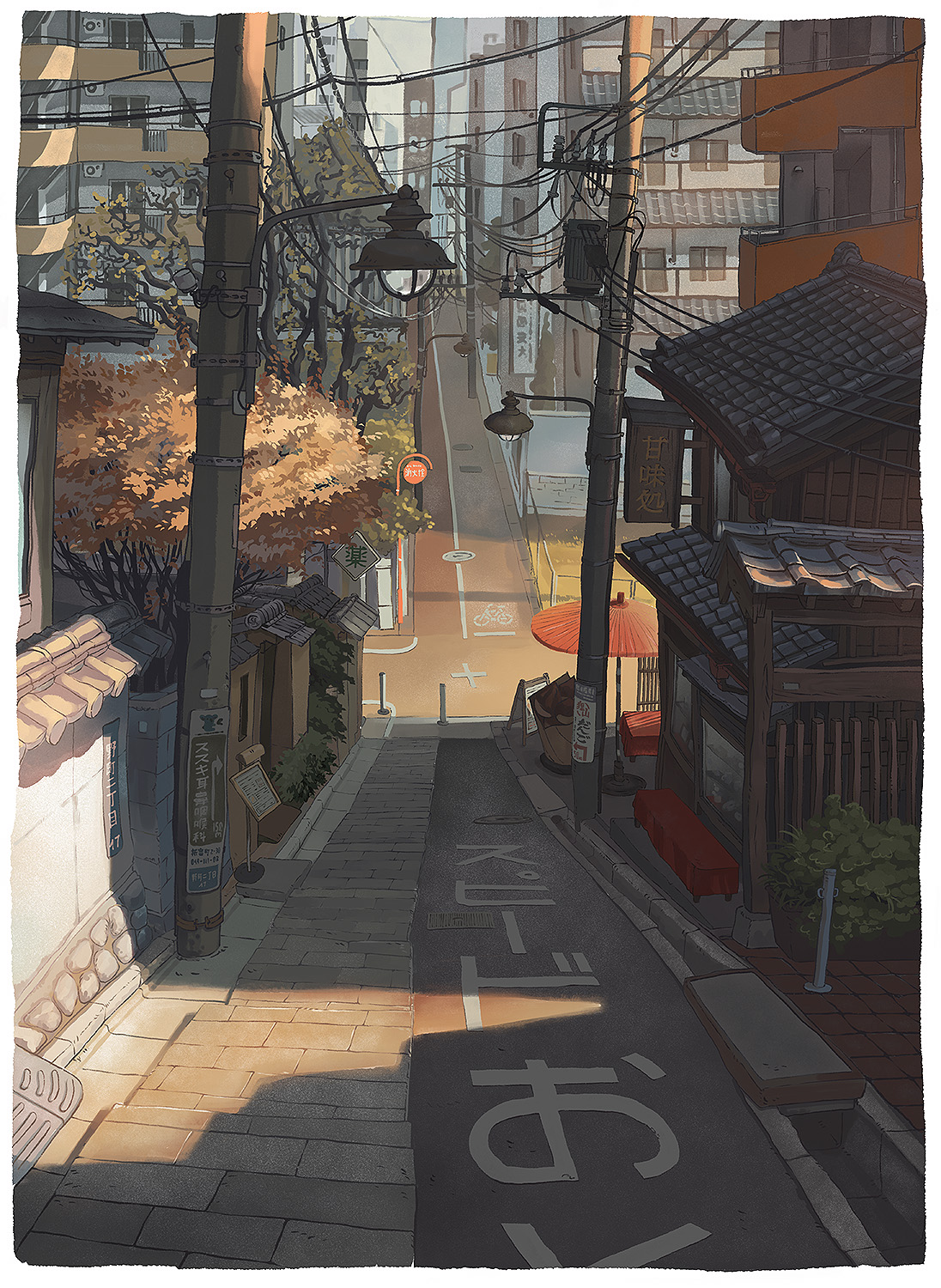
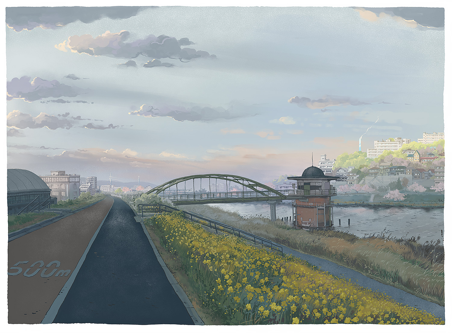
Painting everyday scenes from an imaginary, pleasant and nostalgic city.
In many of my previous projects, I searched for pleasant, exciting, and nostalgic Japanese cityscape fragments. I then painted them as best as possible to make them look even more appealing. I tried to bend the reality I saw to do my artistic bidding, as is often done by animation background artists. Next, in the “Tokyo at Night” book, I explored and portrayed Tokyo’s night side, trying to uncover the truth about it. When painting those illustrations, I realized that I could make even quite desolate, grimy back streets seem appealing. This was a problem. Even though the final pictures looked “cool,” I wouldn’t say I like the original places, really, and would not want to live in a city like that at all.
So, together with Kana, we started thinking about how a more pleasant to live in city would look like. I tried to imagine everyday scenes from such a place without making them look too nostalgic and unobtainable. It’s not the “rose-colored” past or a world from an animated movie that will never come to be. I’m tried to paint a city that could exist in Japan even now.



Scenes of Japan
Apr – Nov 2020
Painting everyday scenes from an imaginary, pleasant and nostalgic city.
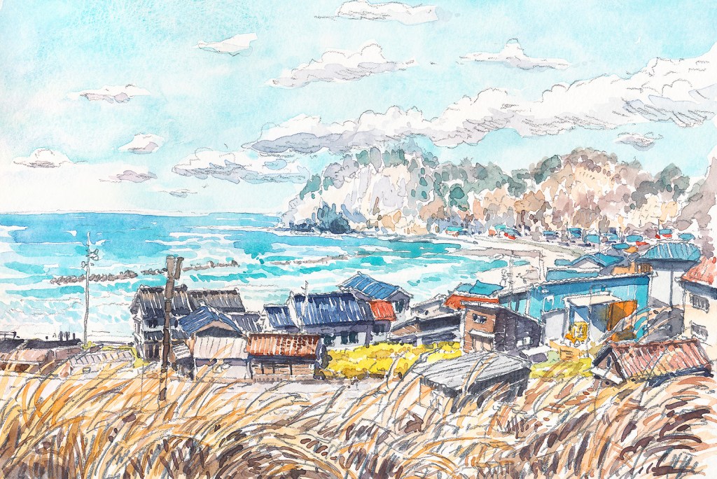
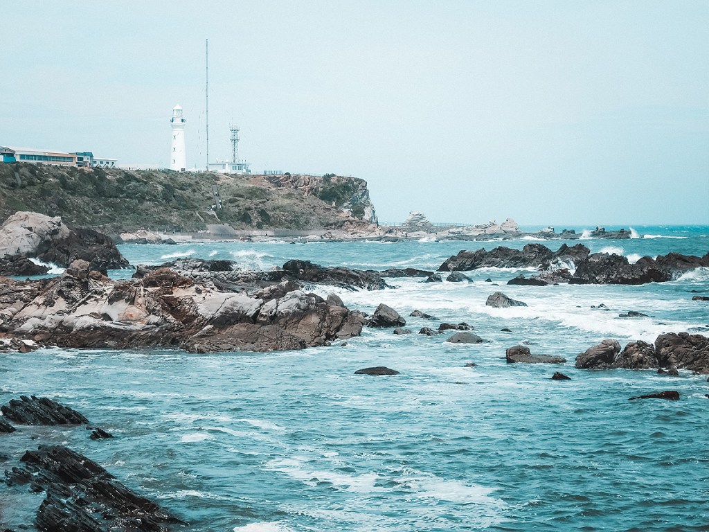
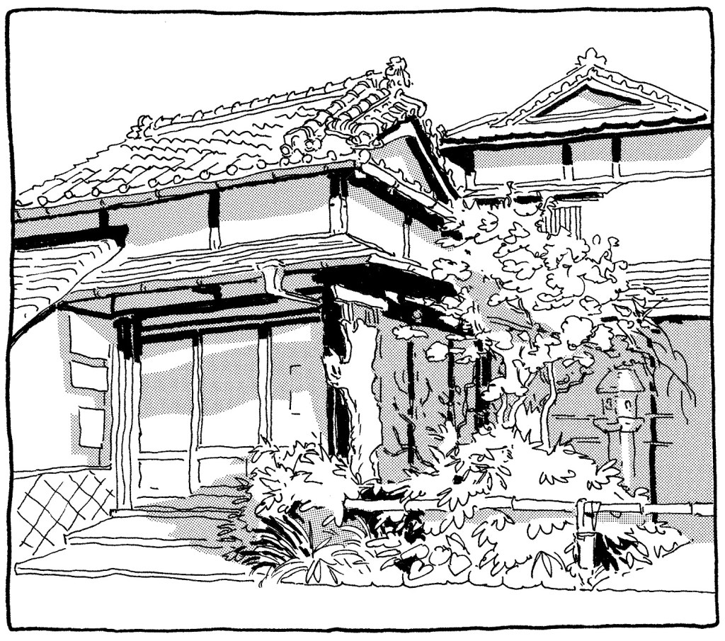
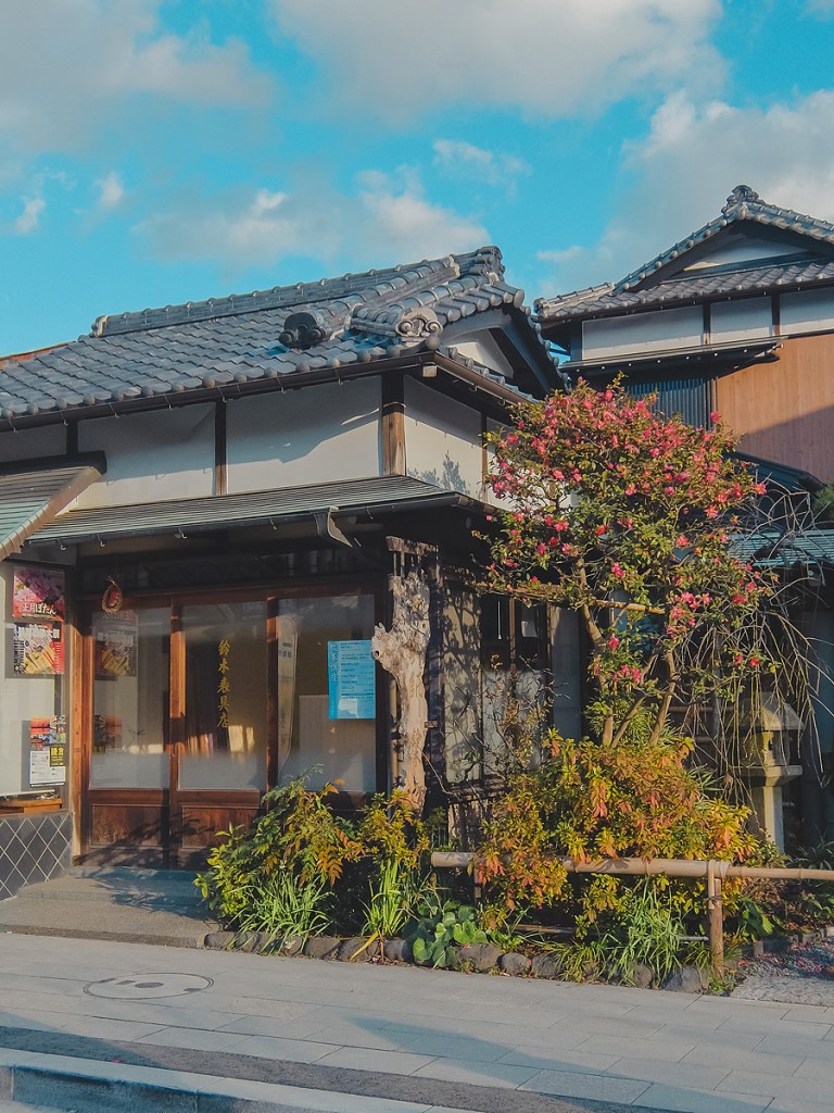
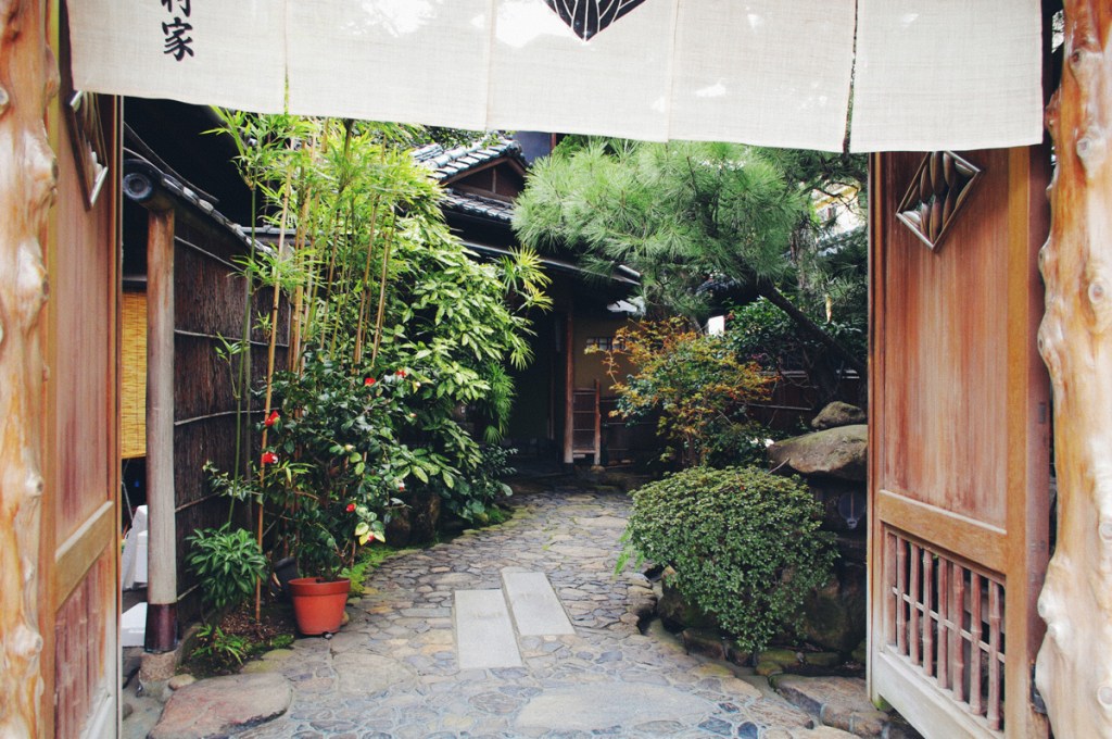
Japanese vistas painted and drawn using multiple techniques.
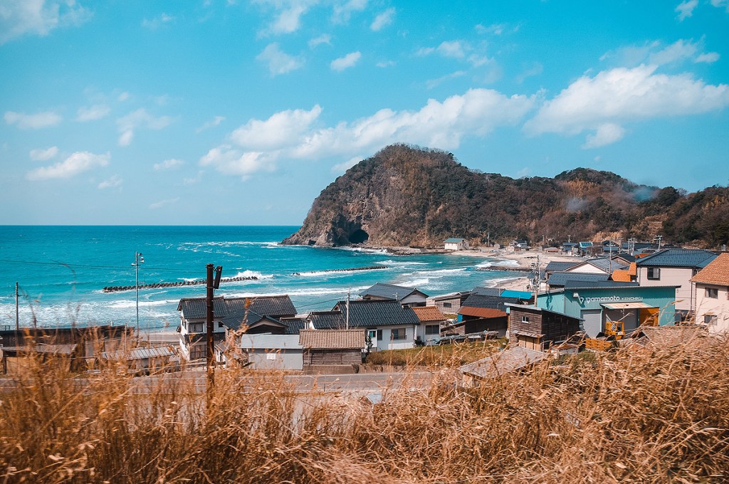
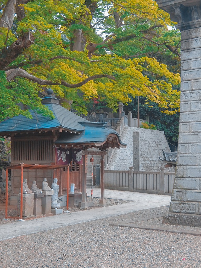
I decided to upload 30 shots of Japan that I hand-picked from my vast library of reference photos for my Patreon supporters to use. I carefully chose pictures of various themes and difficulties and edited them with more inspiring color themes.
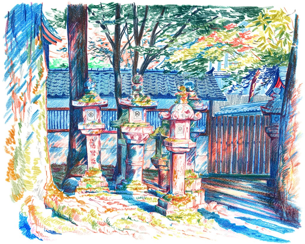
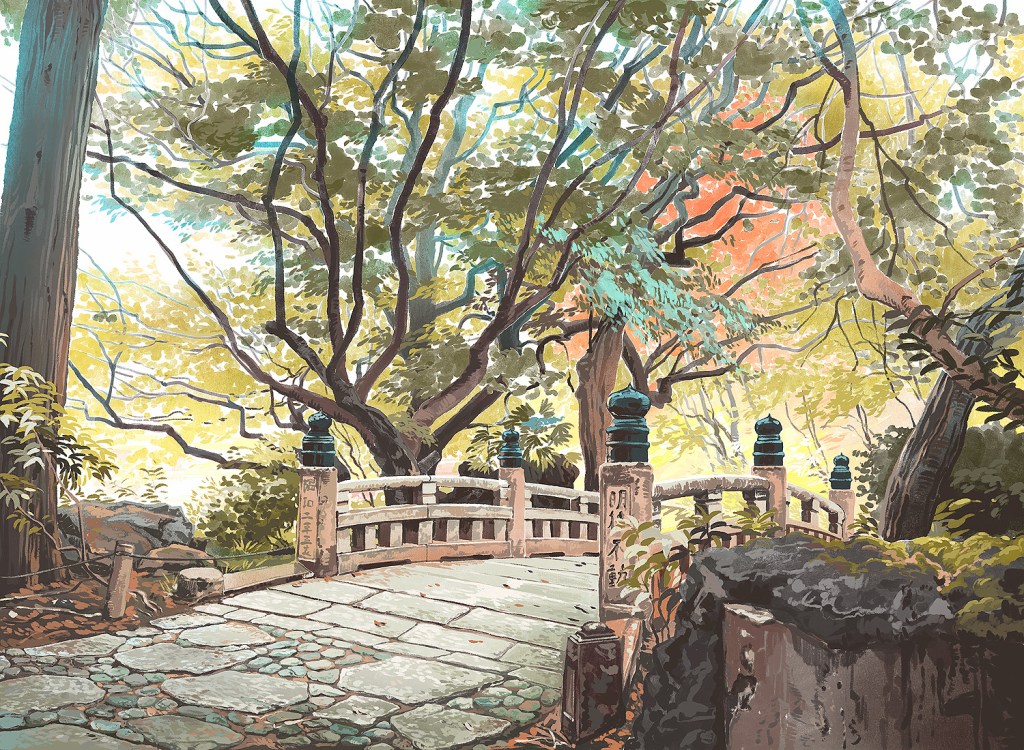
To show how some of the photos can be used for making art in various media, I tried to create some pieces based on them (and some other shots) myself using quite a variety of techniques.
I also added to this set some other sketches, paintings and drawings of Japan I did testing various media in 2020.








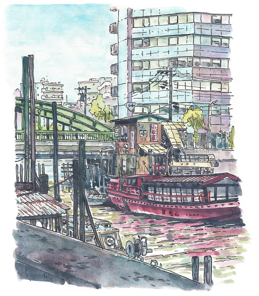

Kagurazaka at Night
Aug 2017 – Sept 2018
A series of ten watercolor illustrations portraying night Tokyo streets that I started painting in 2017. Painting in between other projects and commissions it took me more than a year to finish this project.
Instead of going for the obvious – cool looking, new built high rise offices I wanted to depict the night scenes of Tokyo that are not so widely seen – back streets, empty alleys, tall buildings and empty parking lots. Mostly brightly lit (even the sky is never just black) with no people, those places have a weird eerie atmosphere that I wanted to recreate.

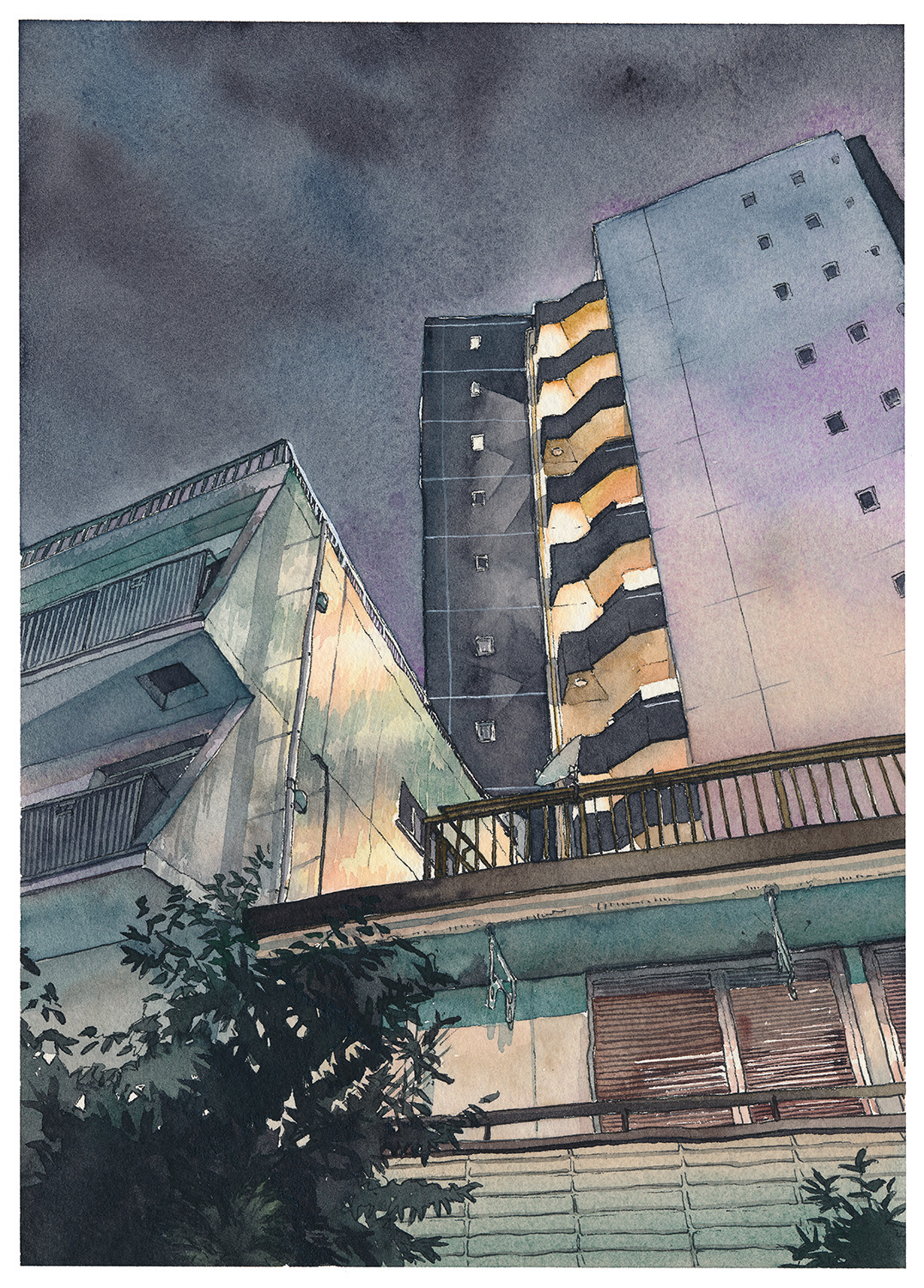
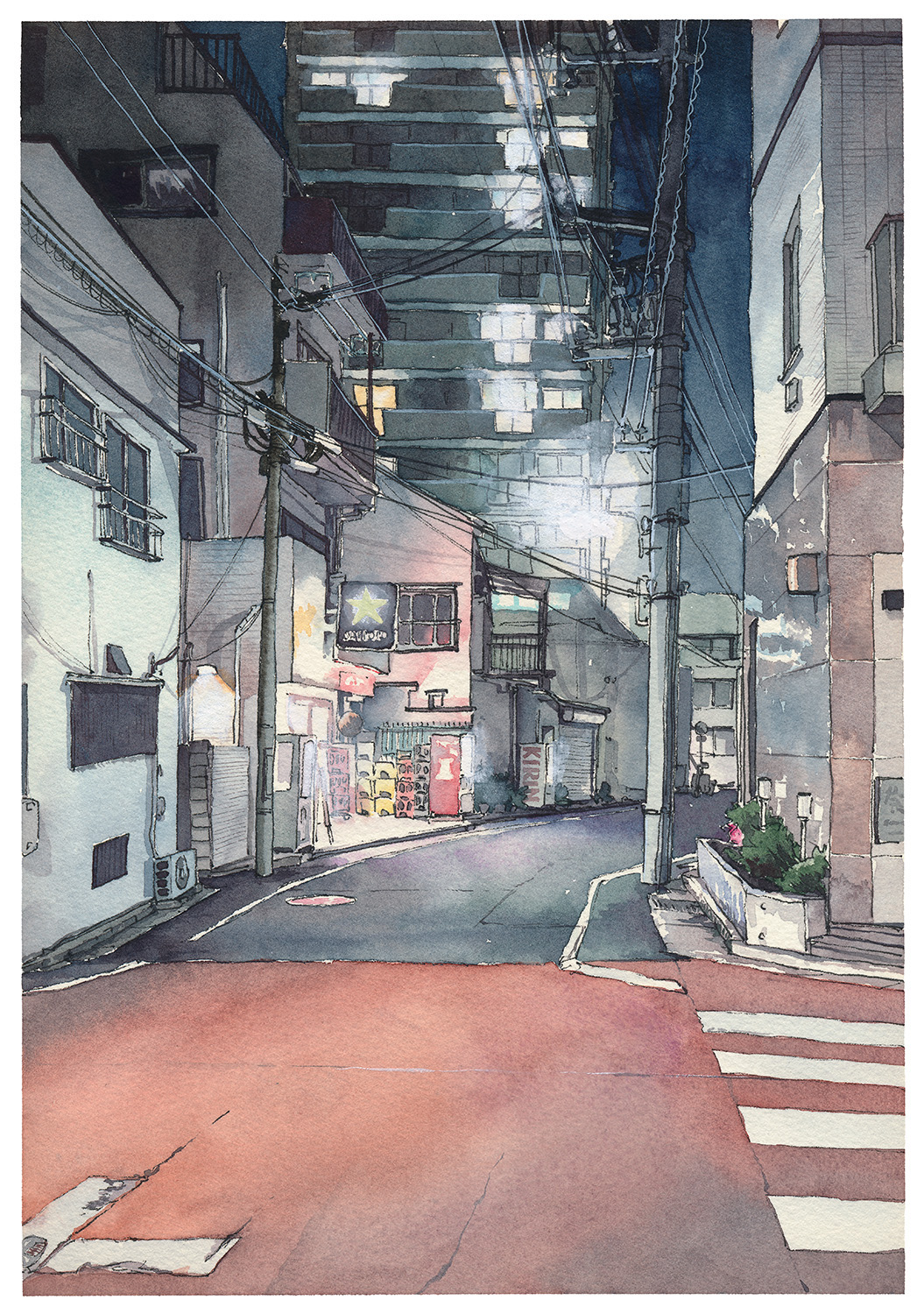


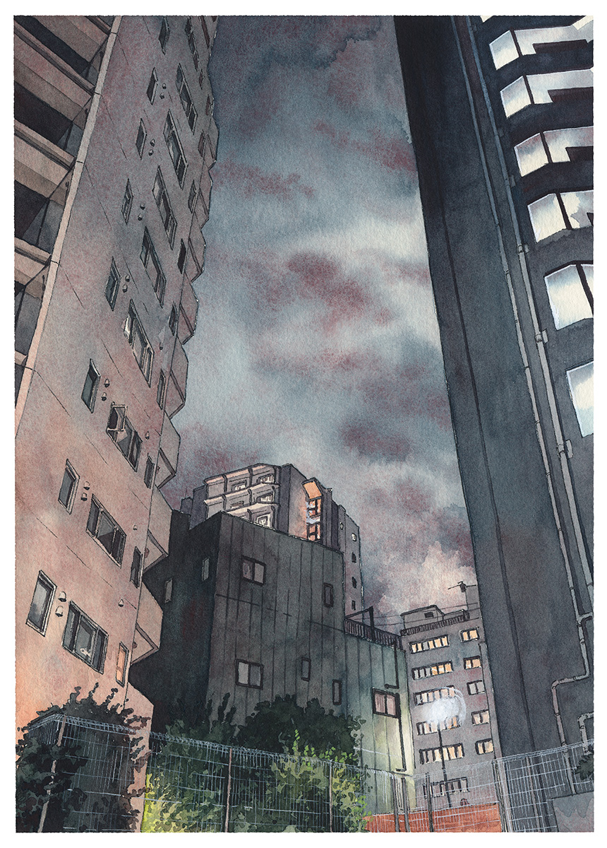
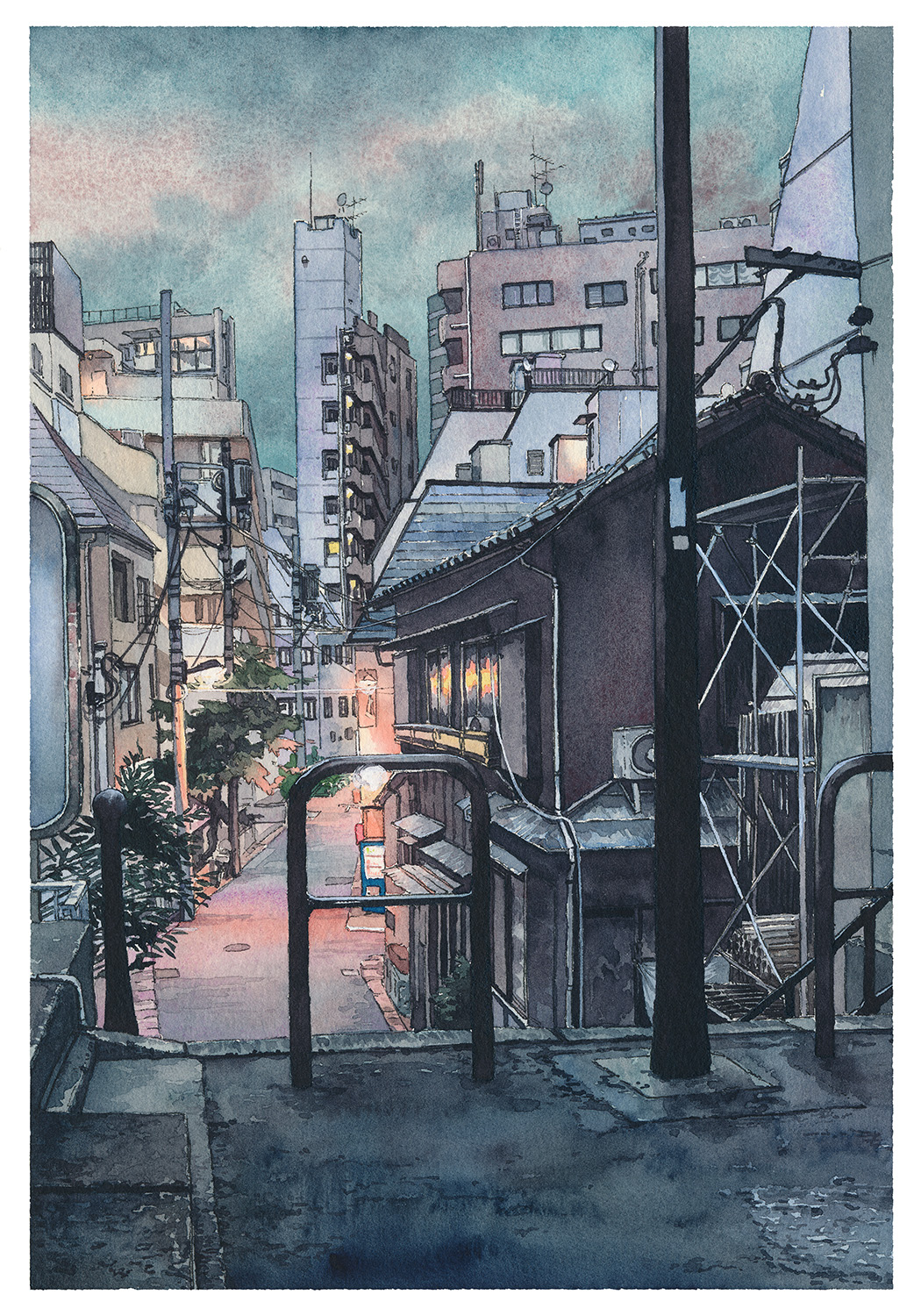
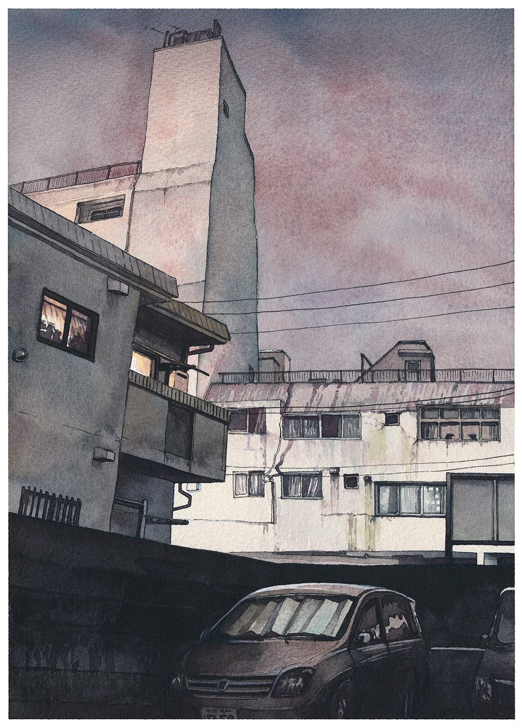

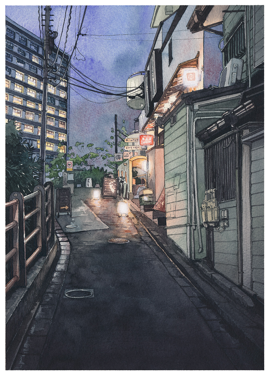
This series follows a path from Kudanshita to Waseda through Kagurazaka.
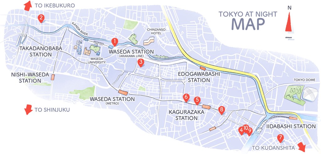
Here are all the spots on Stroly.com (thanks Gio!) if you want to explore by yourself: See the map on Stroly.com »
- Paper: HOLBEIN Waterford natural 300g/m cotton paper
- Sketch: Mitsu-bishi Hi-Uni pencil grade HB
- Line: COPIC Multiliner SP 0.5mm
- Colors: my main Schmincke set (see the tools section)
Additionally, I used the airbrush in some of the later pieces to get some additional depth and shadows. I’m showing more about this technique in the making-of videos.
Cold In Yokohama
Aug – Nov 2015
A series of eight original watercolor illustrations painted between August and November 2015 accompanied by making-of and tutorial videos.
This series was somewhat inspired by the Studio Ghibli movie “From Up on Poppy Hill” – I went few times to Yokohama and looked for the remnants of the old port city I saw in the movie. There are some places, shops and streets that still have this unique atmosphere but a lot of the old Yokohama is gone. There is no trace left of the iconic street-car, wooden dock buildings, or river channels busy with barges.
I wanted to do an illustration series showing Yokohama as I see it in my head – a modern, lively city but with this nostalgic feel to it. Also there is nothing better than a story ending with a hot-pot party on a chilly snow day!
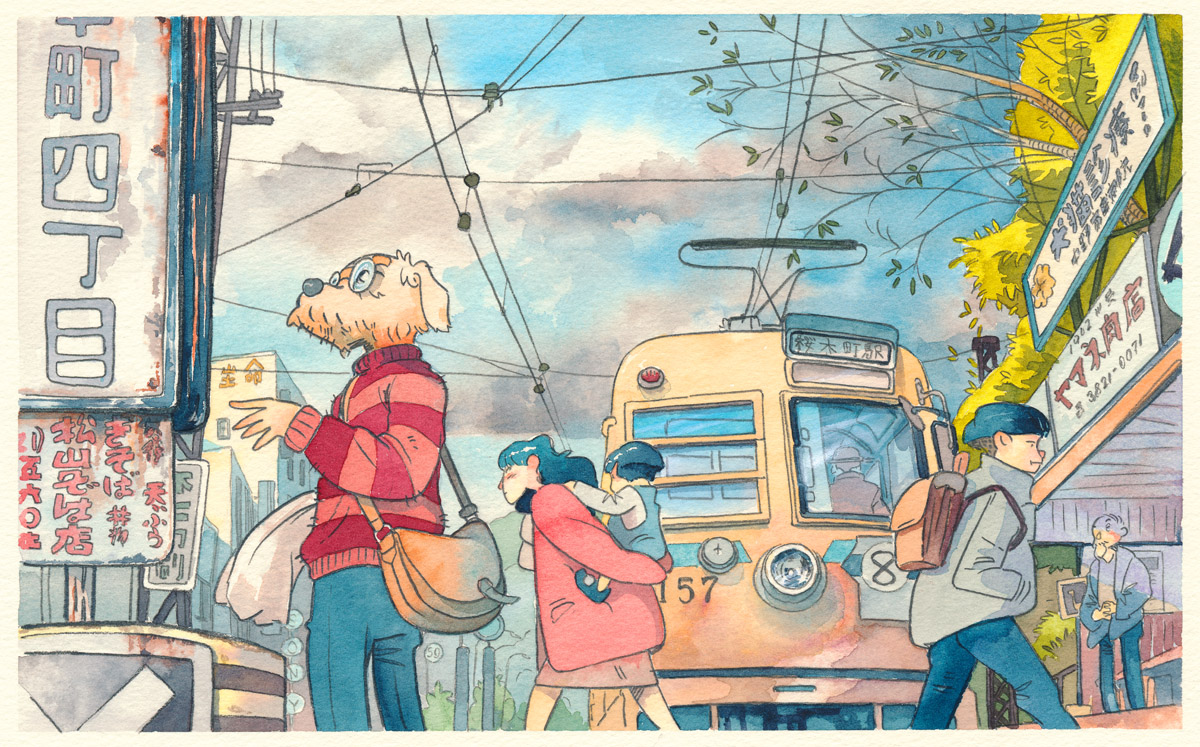
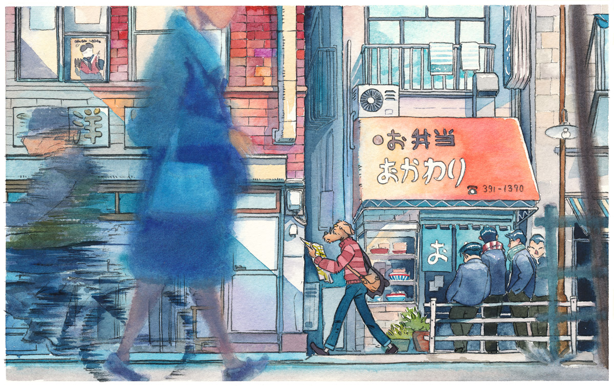
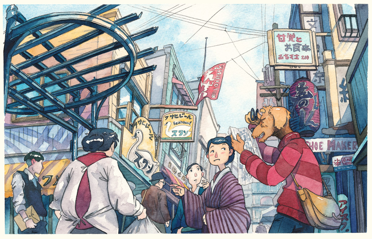
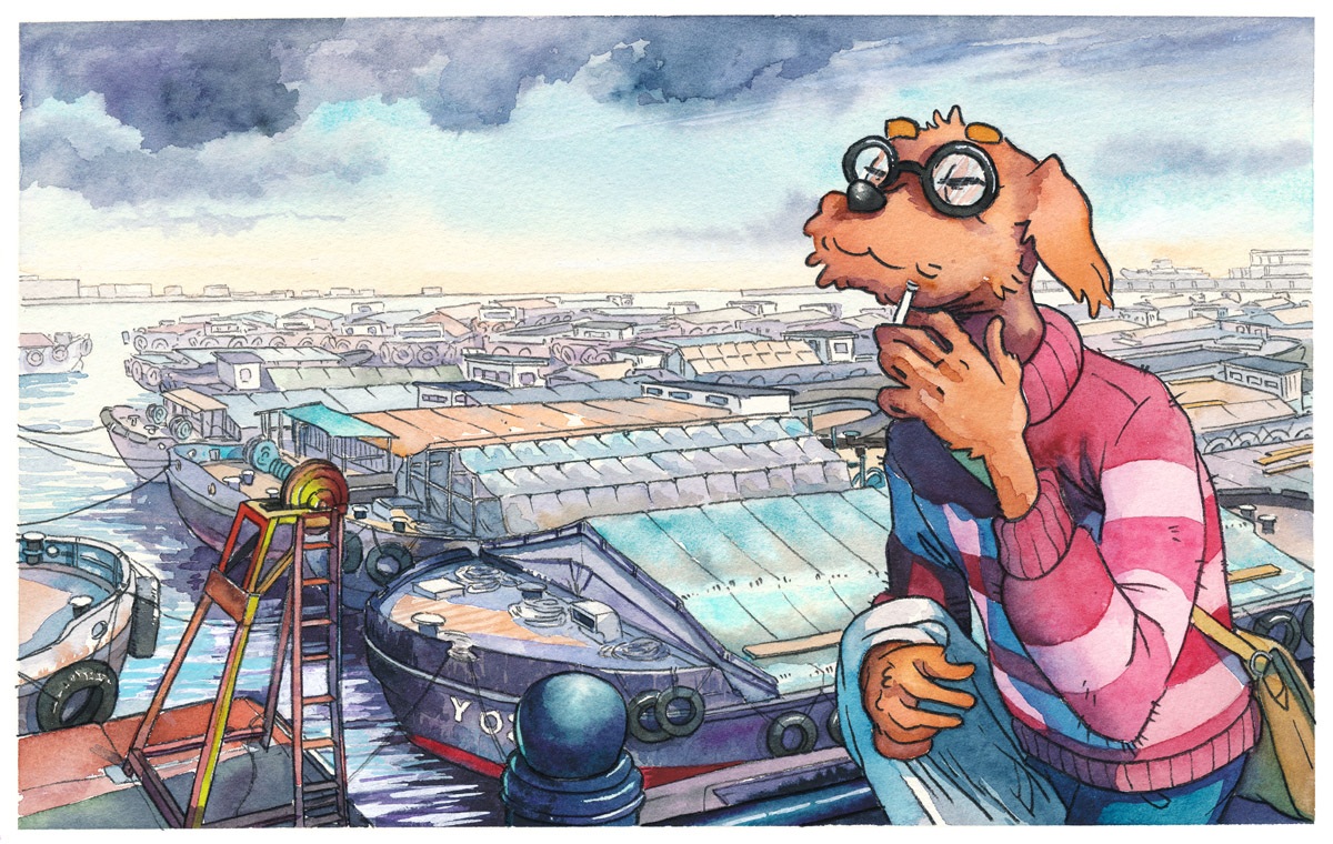

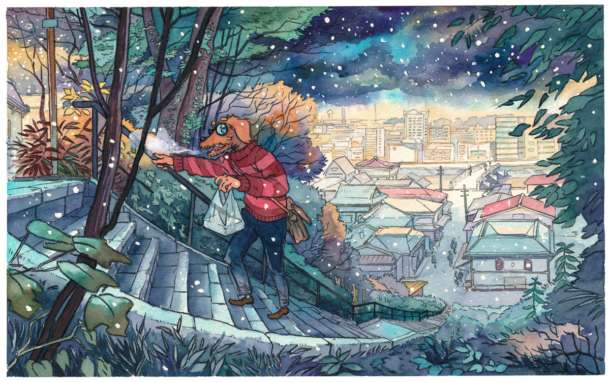


Technical details:
- Lines – mitsu-bishi pencils, grades HB to 8B
- Colors – Shmincke, Winsor and Newton brand watercolors
- Paper – 300g/㎡ Holbein SAUNDERS natural white, cold press F4 size
Bicycle Boy 自転車少年
Oct 2014 – Mar 2015
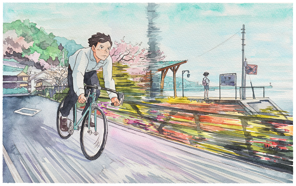
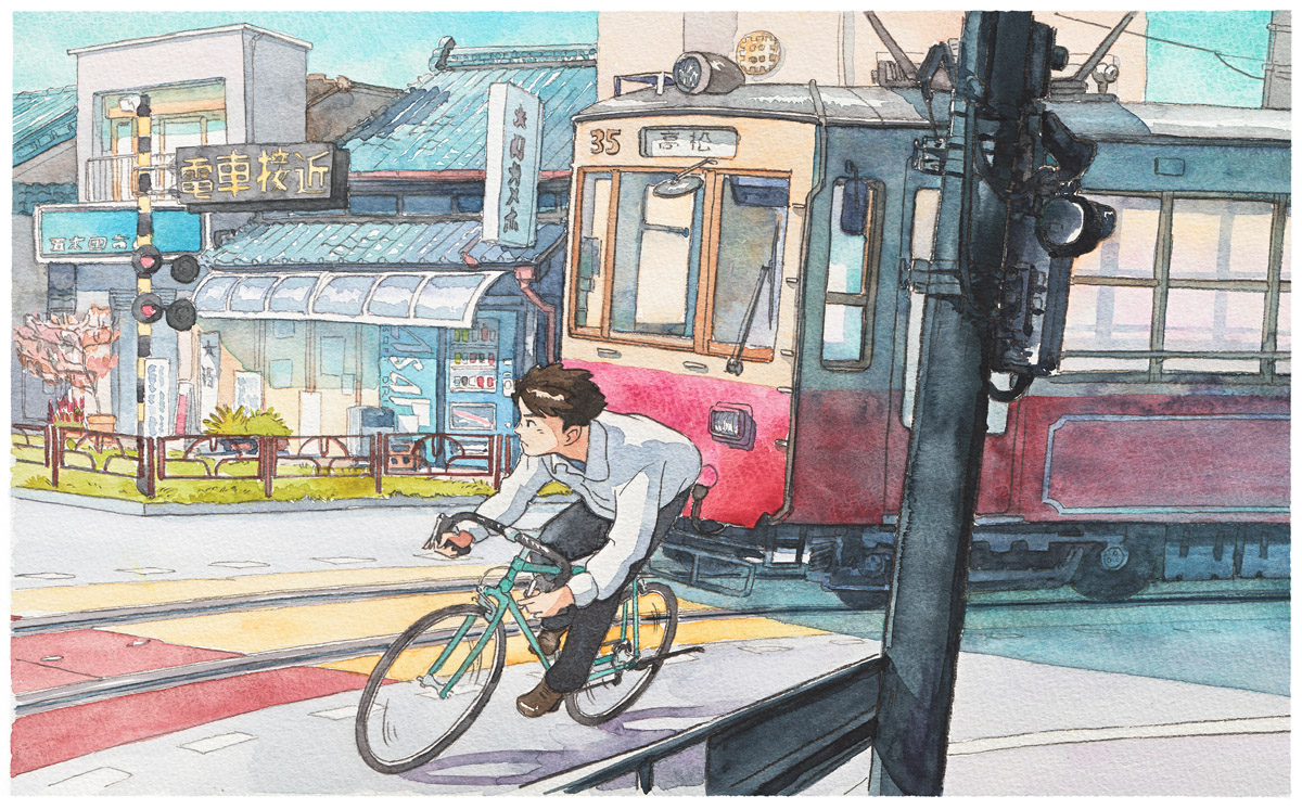
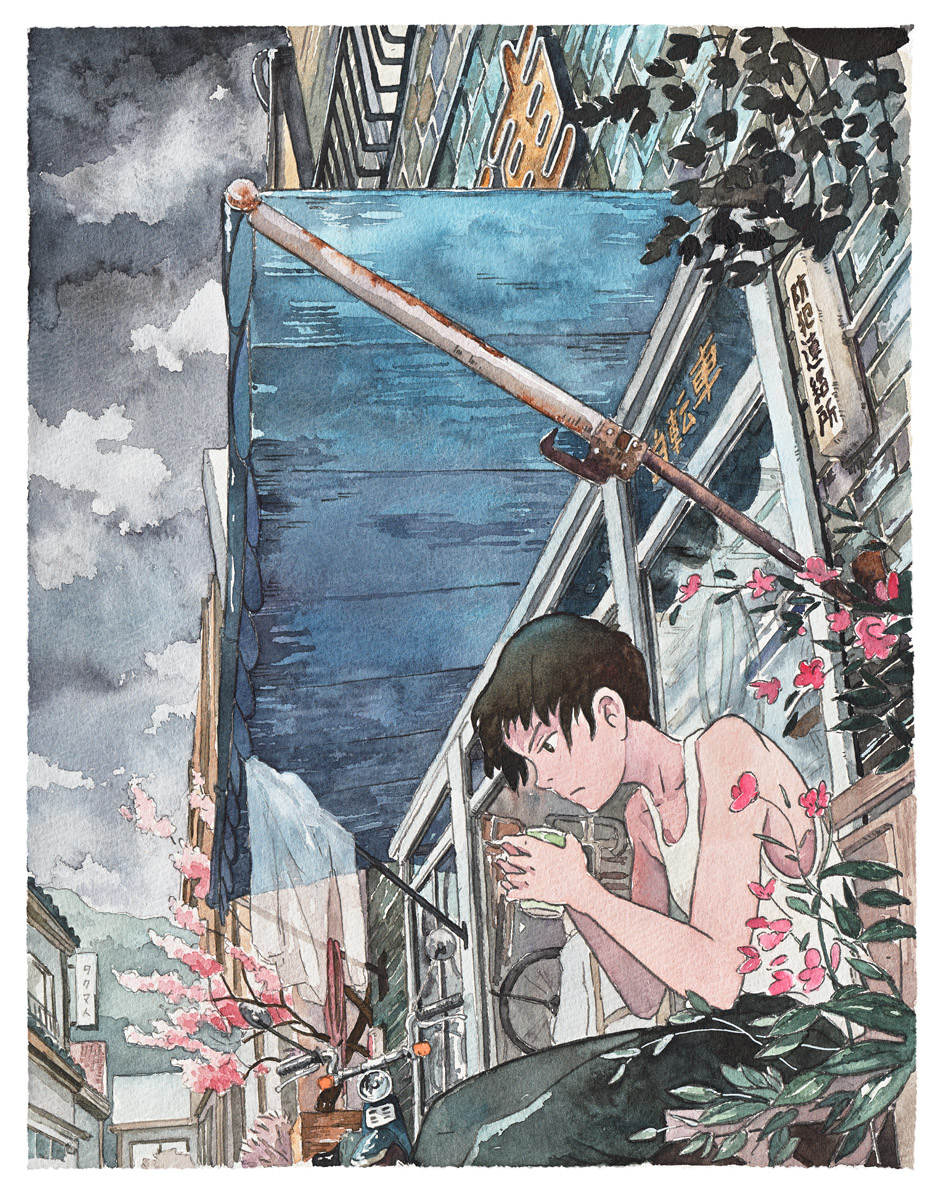
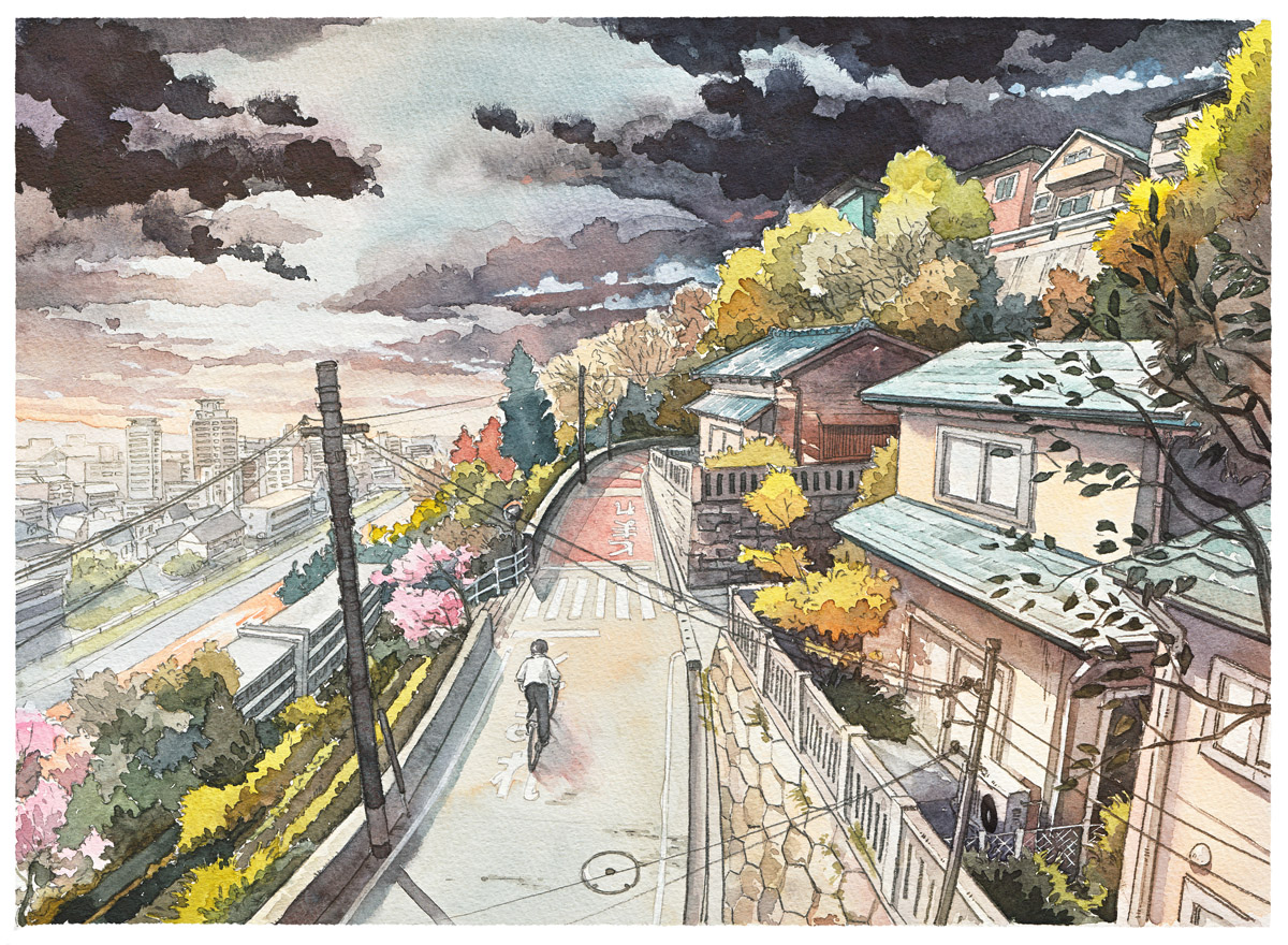
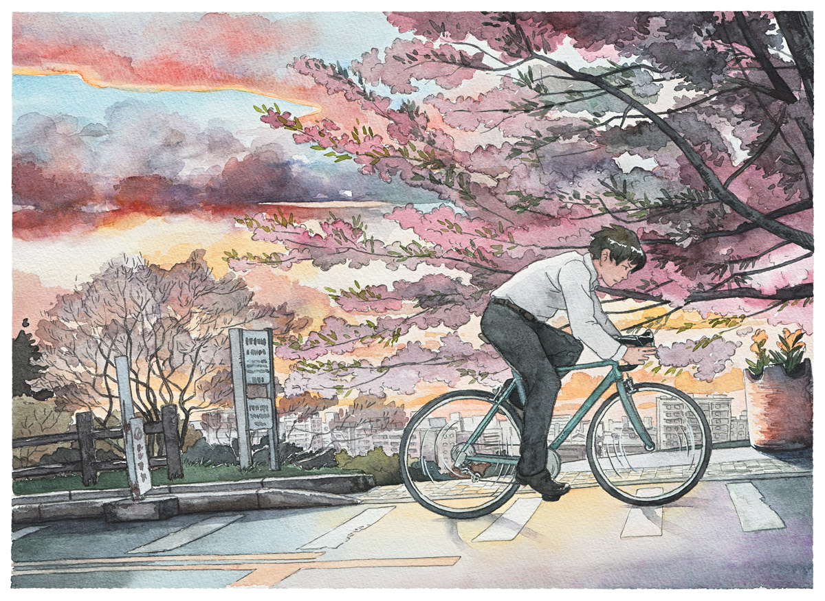
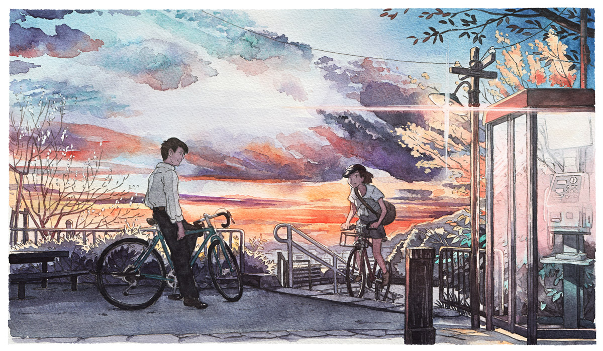
This project started as something I did just for fun in my free time. Inspired by the animated Studio Ghibli movie “Whisper of the Heart” and its original setting location Seiseki Sakuragaoka in Tokyo, I did the first watercolor illustration which quickly spread through the Internet. Following this I decided to make a 10 piece series about the bicycling-it-hard-boy through his day as he fights to reach his goal.
Finally, because of the rarely shown in this way modern Japan, this series was featured on many Japan-themed portals and blogs (as KOTAKU for example), and got to be published, along with an interview in a Studio Ghibli’s book about the “Whisper of the Heart” movie.
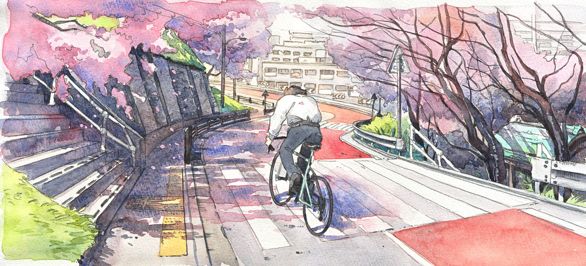
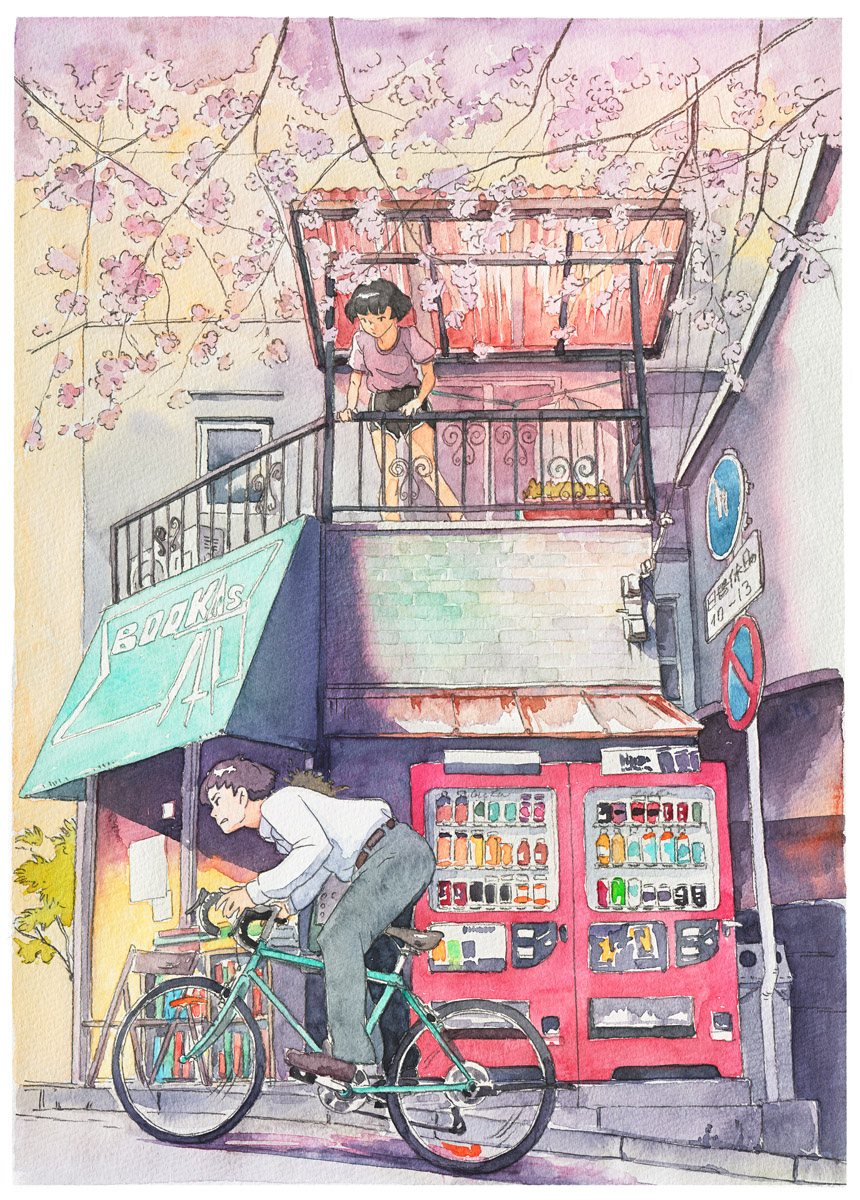
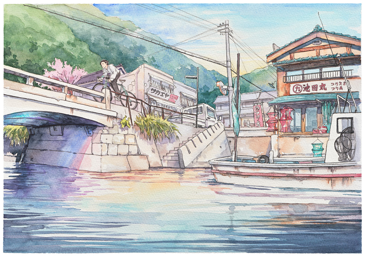

Technical details:
Colours: Holbein, Schmincke and Winsor&Newton watercolours
Paper: I used the same sketchbooks as Hayao Miyazaki used for his concept sketches
Lines: 6B pencil
