This list is constantly updated as I discover new tools and change my habits. Also, I’m limiting myself only to featuring the tools I actually use and own currently, and not all the good stuff I’ve met over the years – think about these as the all-time hits that never go off the top charts:
Drawing Tools:
IndiGraph fountain pen, EF nib
I have been using this fountain pen constantly since I received one of the first prototypes from its creator. It never left my pen case, and currently too I’m still drawing with the final version (steel extra-fine EF nib). This fountain pen (thanks to a specially designed cap) can be safely used with black, waterproof India Ink, which makes it perfect for sketching and using together with watercolors. The pen is almost entirely made of metal, and the nibs are very easy to replace. I have been making all my recent storefronts illustrations with this fountain pen.

ROTRING ISOGRAPH
I usually use my fountain pen for line work, but if I want thinner, more stable lines, I use an isograph. I used to use a Faber-Castell rapidograph, but as they are not easily available in Japan, I’m currently using the Rotring Isograph pens of various line widths. I usually take good care of cleaning the pens if I don’t plan to use them for longer, so I haven’t had any problems with clogging, and anyway, the parts are easily available. With these pens, I’m using the original Rotring black ink. One tip: The line thickness and flow can vary depending on how well the paper handles the Rotring ink.

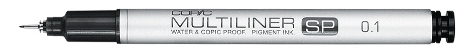
COPIC Multiliner SP
For more quick-and-dirty ink sketching, I often use the COPIC multiliner SP felt-tipped fineliners. I have only a few thicknesses from 0.1 to 0.5mm, but usually it is the 0.3mm that rides in my pen case. From the many fineliner brands available in Japan, I choose the COPIC SPs because of the metal construction and availability of ink cartridges and spare parts (the nibs can be replaced if damaged) – these pens feel a lot more like proper professional tools than the disposable counterparts. On the minus side, the ink, though properly waterproof and working fairly well even on worse quality paper, is not as richly black as I would like it to be.

Platinum – Carbon ink
I use this black ink a lot in my work whenever waterproof black ink is needed (and when it’s not needed as well, to be honest – having the lines waterproof saves on any worry of smudging). This ink gives beautiful black lines and washes and is very waterproof. I use it in mostly in the Indigraph fountain pen but it works well also with manga inking dip pens. This ink can bleed on worse quality paper though (like thin Moleskine, etc.)
Mitsu-Bishi Hi-Uni from grade 2H to 4B
I tried a lot of Japanese brand pencils and like many of them, but for me, the Hi-Unis are the best (closely followed by TOMBOW). These pencils feel extremely soft and “silky” and give consistent, dark lines. Also, the quality of the wood and finishing is superb! Because of these characteristics, these pencils are widely used in Japanese animation for drawing animation frames. Tip: Japanese pencils generally feel a lot softer than European pencils of the same hardness.

Kutsuwa HiLINE Hokusign Pencils
Mitsubishi Hi-UNI, being my usual go-to (and easy to buy anywhere in Japan), the Hokusign “Hardly Broken Pencil” 2B and 4B did impress me enough recently to earn a permanent place in my toolbox. As the tagline says, thanks to the unique 2 mm high-density polymer graphite core, these pencils prove very durable even if sharpened to a very fine point, while giving smooth and uniform lines. The quality of the wood and lacquer is also top-notch. I’m happy to see some innovation and great quality.

Painting Tools:
Lately, pushed by a certain drive to keep my workspace as minimalistic and clean as possible, I decreased the number of watercolor sets I own to only two. This way, I actually use them and can learn all their characteristics by heart.
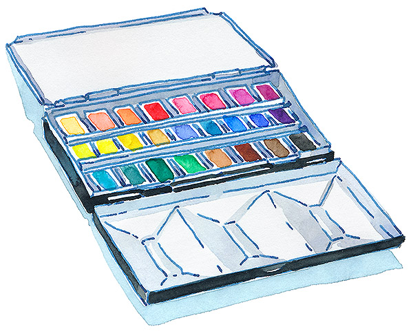
Mijello Pure Pigment Set.
For most of my work, I use the Mijello Mission Gold Pure Pigments set that consists of 25 colors (I did not put the white paint into this box). The Pure Pigments set tubes all contain single pigment paint and provide excellent saturation, which is very useful when painting in a style like mine. All the colors featured in this set are well balanced, so I don’t feel like I’m limited or that I have to reach for any other brands to get the effects I want, but because these are all very basic tones, sometimes the mixing required to get any more specific or complex shades can get a bit tedious (especially with greens). Also, this set does not contain many granulating paints, thus the second palette:
Granulating Colors Set.
The second metal box I own currently (the same size and shape as the one with Mijello paints) holds a set of only high-granulation, “special effect” paints. These are a mix of a few brands: mostly Holbein high granulation line and Kusakabe Harmonia granulation paints, with a small addition of Schmincke granulating colors (kept to a minimum because of how expensive these are in Japan). I wanted to make a set that, although holding most basic colors and allowing to paint a whole picture from start to finish, holds only “interesting” paints that are completely different in character than the ones I usually use. With this set, I can break away from my everyday work habits and make painting more exciting and explorative.
Brushes:

Escoda Perla SINTETICO sizes 2 to 8
These are the main, everyday-use brushes for most of my watercolor painting, and especially when I want some sharper, pointy touches. The Perla series uses great quality synthetic fibers, which are springy but not too stiff and can hold (and release) water well enough that I don’t feel that I’m missing anything compared to natural hair brushes. These brushes also have a bit thicker handles than other brands, which I like a lot. The minus is that the white tips get dyed dirty blue when used – it does not impact the usability, only looks.
ISABEY SIRIUS and ISAQUA
These are great, French-made watercolor brushes which I found last year in Paris and just could not resist their great looks – the wooden handles and brass ferrules are just so magical! I use quite a few of the Isabey (fully synthetic) and Syrius (synthetic and natural mix) round brushes whenever I’m aiming for a bit rounder touches – the tip is not as sharp as in the Escoda. So far, these brushes have been doing excellently; they hold water and paint very well, and clean-up quite nicely also. The only nitpicking minus is the gold lettering that disappears because of use – it’s hard to guess which line and number brush is once the text is gone.
Paper:

Paper is one of the most important tools in watercolor painting – maybe more important than good brushes!
For most of my work, I use 300g/m heavyweight watercolor paper. SAUNDERS Waterford White is one of the best I’ve used, with a great quality-to-price ratio. It’s thick, so it does not warp very much with my style of watercolor painting (I don’t use so much water). It also has a rather unyielding surface, so it handles sketching with a hard pencil, intensive erasing, and ink quite good as well (the ink does not seep in, bleed, or spread uncontrollably).
At the same time, it’s a pleasure to use watercolor on this paper as it gives smooth transitions and really flat, even washes with beautiful, not obnoxious, texture. I used to use the cold-pressed variation most of the time, but recently I’m growing more and more fond of the hot-press one, which has almost no texture. It’s better for ink and wash pieces, like my storefronts illustrations.
The only downside to this paper is it’s relatively short shelf-life – this might be caused by the harsh Japanese climate, but I had a lot of the Waterford blocks, and sketchbooks go bad with the sizing not repelling away water properly anymore. I would recommend not overstocking on this brand!
